# AI Data Grid
> Documentation for AI Data Grid, a fast canvas-based React data grid.
This document contains the full content of all documentation pages for AI consumption.
---
## About & License
**URL:** https://ai-data-grid-docs.vercel.app/docs/about
**Description:** About AI Data Grid, its origins, and its license.
## About
AI Data Grid is a fast canvas-based React data grid maintained by SpecStory. It is a hard fork of Glide Data Grid, which is no longer maintained upstream.
Forked from Glide Data Grid by Glide (typeguard, Inc.), MIT licensed.
## License
AI Data Grid is released under the MIT License.
* Original work: Copyright (c) 2021 typeguard, Inc.
* New work: Copyright (c) 2026 ai-data-grid contributors
The full license text:
```text
MIT License
Copyright (c) 2021 typeguard, Inc.
Copyright (c) 2026 ai-data-grid contributors
Permission is hereby granted, free of charge, to any person obtaining a copy
of this software and associated documentation files (the "Software"), to deal
in the Software without restriction, including without limitation the rights
to use, copy, modify, merge, publish, distribute, sublicense, and/or sell
copies of the Software, and to permit persons to whom the Software is
furnished to do so, subject to the following conditions:
The above copyright notice and this permission notice shall be included in all
copies or substantial portions of the Software.
THE SOFTWARE IS PROVIDED "AS IS", WITHOUT WARRANTY OF ANY KIND, EXPRESS OR
IMPLIED, INCLUDING BUT NOT LIMITED TO THE WARRANTIES OF MERCHANTABILITY,
FITNESS FOR A PARTICULAR PURPOSE AND NONINFRINGEMENT. IN NO EVENT SHALL THE
AUTHORS OR COPYRIGHT HOLDERS BE LIABLE FOR ANY CLAIM, DAMAGES OR OTHER
LIABILITY, WHETHER IN AN ACTION OF CONTRACT, TORT OR OTHERWISE, ARISING FROM,
OUT OF OR IN CONNECTION WITH THE SOFTWARE OR THE USE OR OTHER DEALINGS IN THE
SOFTWARE.
```
The same text is in the `LICENSE` file at the root of the repository.
---
## FAQ
**URL:** https://ai-data-grid-docs.vercel.app/docs/faq
**Nothing shows up!**
Please read the Prerequisites section in the docs.
**It crashes when I try to edit a cell!**
Please read the Prerequisites section in the docs.
**Does it work with screen readers and other a11y tools?**
Yes. Unfortunately none of the primary developers are accessibility users so there are likely flaws in the implementation we are not aware of. Bug reports welcome!
**Does it support my data source?**
Yes.
Data Grid is agnostic about the way you load/store/generate/mutate your data. What it requires is that you tell it which columns you have, how many rows, and to give it a function it can call to get the data for a cell in a specific row and column.
**Does it do sorting, searching, and filtering?**
Search is included. You provide the trigger, we do the search. See the [Search example](https://ai-data-grid-storybook.vercel.app/?path=/story/ai-data-grid-docs--search) in our Storybook.
Filtering and sorting are something you would have to implement with your data source. There are hooks for adding column header menus if you want that.
The reason we don't add filtering/sorting in by default is that these are usually very application-specific, and can often also be implemented more efficiently in the data source, via a database query, for example.
**Can it do frozen columns?**
Yes!
**Can I render my own cells?**
Yes, but the renderer has to use HTML Canvas. See [Implementing Custom Cells](/docs/guides/implementing-custom-cells) for a walkthrough, and the [Custom Drawing example](https://ai-data-grid-storybook.vercel.app/?path=/story/ai-data-grid-dataeditor-demos--custom-drawing) in our Storybook.
**Why does Data Grid use HTML Canvas?**
Originally we had implemented our Grid using virtualized rendering. We virtualized both in the horizontal and vertical direction using [react-virtualized](https://github.com/bvaughn/react-virtualized). The problem is simply scrolling performance. Once you need to load/unload hundreds of DOM elements per frame nothing can save you.
There are some hacks you can do like setting timers and entering into a "low fidelity" rendering mode where you only render a single element per cell. This works okay until you want to show hundreds of cells and you are right back to choppy scrolling. It also doesn't really look or feel great.
**I want to use this with Next.js / Vercel, but I'm getting weird errors**
The easiest way to use the grid with Next is to create a component which wraps up your grid and then import it as a dynamic.
home.tsx
```tsx
const Grid = dynamic(
() => {
return import("../components/Grid");
},
{ ssr: false }
);
export const Home: NextPage = () => {
return (
Hi
);
};
```
grid.tsx
```tsx
export default function Grid() {
return ;
}
```
---
## Welcome to AI Data Grid
**URL:** https://ai-data-grid-docs.vercel.app/docs
**Description:** AI Data Grid is a fast canvas-based React data grid. These docs cover version 7.0.0.
Welcome to the official documentation for AI Data Grid, the powerful, flexible, and efficient data grid designed for modern web applications. Whether you're a seasoned developer or just starting out, our documentation will guide you through the features and functionalities of AI Data Grid, helping you to integrate and leverage its capabilities in your projects.
AI Data Grid is forked from Glide Data Grid by Glide (typeguard, Inc.), MIT licensed. Version 7.0.0 is API-compatible with Glide Data Grid 6.x. To migrate, upgrade your app to React 19 first (React 16, 17 and 18 are not supported), then change the package names in your `package.json` and your imports.
## 👩💻 Features at a Glance
* **It scales to millions of rows**. Cells are rendered lazily on demand for memory efficiency.
* **Scrolling is extremely fast**. Native scrolling keeps everything buttery smooth.
* **Supports multiple types of cells**. Numbers, text, markdown, bubble, image, drilldown, uri
* **Fully Free & Open Source**. MIT licensed, so you can use Grid in commercial projects.
* **Editing is built in**.
* **Resizable and movable columns**.
* **Variable sized rows**.
* **Merged cells**.
* **Single and multi-select rows, cells, and columns**.
* **Cell rendering can be fully customized**.
* **Much much more...**
Lots of fun examples are in our [Storybook](https://ai-data-grid-storybook.vercel.app).
## ⚡ Quick Start
AI Data Grid requires React 19. Install the data grid:
```shell
npm i @specstory/ai-data-grid
```
You may also need to install the peer dependencies if you don't have them already. `marked` must be 16.x (the peer range is `^16.0.10`), so name the major version:
```shell
npm i lodash marked@^16 react-responsive-carousel
```
Create a new `DataEditor` wherever you need to display lots and lots of data
```tsx
```
Don't forget to import mandatory CSS
```ts
```
Making your columns is easy
```ts
// Grid columns may also provide icon, overlayIcon, menu, style, and theme overrides
const columns: GridColumn[] = [
{ title: "First Name", width: 100 },
{ title: "Last Name", width: 100 },
];
```
Last provide data to the grid
```ts
// If fetching data is slow you can use the DataEditor ref to send updates for cells
// once data is loaded.
function getData([col, row]: Item): GridCell {
const person = data[row];
if (col === 0) {
return {
kind: GridCellKind.Text,
data: person.firstName,
allowOverlay: false,
displayData: person.firstName,
};
} else if (col === 1) {
return {
kind: GridCellKind.Text,
data: person.lastName,
allowOverlay: false,
displayData: person.lastName,
};
} else {
throw new Error();
}
}
```
### Full API documentation
The full [API documentation](/docs/api) is available in the API section.
---
## Configuration
**URL:** https://ai-data-grid-docs.vercel.app/docs/ai-fill/configuration
**Description:** The aiFill prop's settings, for the grid and for each AI column, with their defaults.
The `aiFill` prop takes an `AIFillConfig`. This page lists every setting. [Examples](/docs/ai-fill/examples) has complete configurations, and every type has TSDoc in the package.
```ts
const aiFill: AIFillConfig = {
connection: { mode: "endpoint", url: "/api/jev" },
model: "jev-latest", // required, no hidden default
rows: { getRowId: row => contacts[row].id }, // results are keyed by stable row id, never by position
rowScope: () => ({ rows: "displayed", label: "filtered contacts" }),
columns: {
// keyed by GridColumn.id
persona: {
primitive: "choice",
instructions: "Which buyer persona best describes this contact?",
sources: ["company", "title"],
options: {
champion: { description: "Drives the purchase internally", label: "Champion" },
economic: { description: "Controls the budget", label: "Economic buyer" },
none: { description: "None of these fit", label: "None of the above", outcome: "none" },
},
policy: {
show: { minProbability: 0.8 },
ready: { minProbability: 0.95 },
autoApply: { minProbability: 0.95 },
},
},
seniority: {
primitive: "score",
instructions: "How senior is this contact?",
sources: ["title"],
levels: ["Individual contributor", "Manager", "Director", "Executive"],
output: { store: "level-label" },
policy: { show: { minConfidence: 0.7 } },
},
ownsBudget: {
primitive: "noul",
instructions: "Does this contact own a budget?",
sources: ["title", "notes"],
output: { store: "boolean", bands: { falseAtOrBelow: 0.2, trueAtOrAbove: 0.8, between: "review" } },
},
},
};
```
## Grid settings
| Field | Meaning | Default |
|---|---|---|
| `connection` | How requests reach Jev: `{ mode: "endpoint", url, headers?, fetch? }`, `{ mode: "direct", apiKey, dangerouslyAllowBrowser?, baseURL?, fetch? }` or `{ mode: "custom", send }`. See [Connecting to Jev](/docs/ai-fill/connecting-to-jev). | required |
| `model` | The Jev model, for example `jev-latest`. The versioned id that answered (for example `jev-1.13.0`) is kept with every answer. | required |
| `rows.getRowId(row)` | The stable id of a display row. Results are keyed by it. | required |
| `rows.getRowIndex(rowId)` | The display row of an id, when you can answer it quickly. Its answer is checked against `getRowId`. | a scan of `getRowId` |
| `rowState(ctx)` | The row state sent to Jev, for every column without its own `state` | built from each column's `sources` |
| `rowScope()` | The rows a column-wide fill covers: `{ rows: "displayed" \| rowId[], label }`. Without it, column-wide fills aren't offered. | none |
| `columns` | AI column definitions, keyed by `GridColumn.id` | required |
| `execution` | Scheduler limits and the confirmation threshold (below) | see below |
| `menus` | `"built-in"`, `"compose"` or `"off"`. See [menus in apps that already have menus](/docs/ai-fill/fill-scopes-and-review#apps-that-already-have-menus). | `"built-in"` |
| `statusBar` | `false` hides the built-in status bar, for example to render `` yourself | `true` |
| `shortcuts` | Rebinds or turns off each keyboard shortcut (`menu`, `inspect`, `accept`, `reject`, `fill`), or `false` for none | see [Keyboard](/docs/ai-fill/fill-scopes-and-review#keyboard) |
| `onReady(api)` | Called once, when AI Fill has loaded and `ref.current.aiFill` exists | none |
| `onRunStart`, `onRunProgress`, `onRunEnd`, `onResult`, `onCommit`, `onReject`, `onError` | Observers (below) | none |
### `execution`
| Setting | Meaning | Default |
|---|---|---|
| `concurrency` | Requests in flight at once. Never exceeded. | 4 |
| `maxRequestsPerMinute` | A token bucket, with bursts of up to one second's worth | 600 |
| `timeoutMs` | The timeout for each attempt | 15000 |
| `maxRetries` | Retries after the first attempt, for retryable failures only | 2 |
| `backoff` | `{ initialMs, maxMs, jitter }`: the delay doubles from `initialMs` up to `maxMs`, minus up to `jitter` of it at random | 500 ms → 5 s, 0.25 |
| `maxCellsPerRun` | A fill that would evaluate more cells is refused before anything is sent | 1000 |
| `confirmAbove` | A fill started from the built-in menus or the fill shortcut that covers more cells asks for confirmation first. `api.fill` never asks. | 100 |
| `maxQuestionsPerRequest` | Columns that share a row's state and model share a request, up to this many questions | 16 |
| `maxStateChars` | A row state longer than this (as JSON) is an `input-too-large` error, before anything is sent | 60000 |
| `cacheSize` | Answers kept for repeated fills of the same cell and input, least recently used first out | 5000 |
A `Retry-After` or `retry-after-ms` of up to 60 seconds from the server is honored instead of the backoff.
## Column settings
Every AI column has these:
| Field | Meaning | Default |
|---|---|---|
| `primitive` | `"choice"`, `"score"` or `"noul"` | required |
| `instructions` | The question: a string, an object or an array | required |
| `sources` | The column ids the question is about. They build the default row state, and editing one makes the row's results stale. | `[]`, and then a `state` or grid `rowState` is required |
| `state(ctx)` | A row state for this column | grid `rowState`, else built from `sources` |
| `context` | Extra context such as definitions or examples, sent as `{ instructions, context }` | none |
| `applies(ctx)` | Whether the column applies to a row. A row where it doesn't is skipped as `not-applicable`. | every row |
| `missingInput`, `isMissing(ctx)` | What to do when the input is missing: `"skip"` or `"evaluate"`. By default the input is missing when the column has sources and every one is empty. | `"skip"` |
| `isEmpty(cell)` | Whether a destination cell is empty. With the default, **`0` and `false` are values, not empty.** | `isAIDestinationEmpty` |
| `overwrite` | `"never"`, `"suggest"` (populated cells only in an explicit selection, never auto-applied) or `"apply"` | `"never"` |
| `fillScopes` | The [fill scopes](/docs/ai-fill/fill-scopes-and-review#fill-scopes) the column takes part in | `["selection", "selection-empty", "column-empty"]` |
| `policy` | The gates `show`, `ready` and `autoApply`, and an optional `decide(ctx)`. See [Result policies](/docs/ai-fill/result-policies). | every valid answer is suggested; nothing is applied automatically |
| `output` | `format(value, answer)` for the display text, `toCell(value, current, ctx)` for the written cell, and the primitive's mapping (below) | per primitive |
| `presentation` | Display options (below) | per primitive |
| `model` | A model for this column | grid `model` |
The default row state is `{ [sourceId]: value }` for each source column, in order: the text of text, URI, markdown and row-id cells (an empty one sends `""`), the number of number cells, the boolean of boolean cells, the data of image and bubble cells, a drilldown's item texts, a custom cell's `copyData`, and `null` for a missing value, an empty number or boolean, and loading or protected cells.
### Choice
- `options: { [id]: { description, label?, value?, outcome? } }`, 2 to 255 of them. The ids and descriptions are what Jev sees. `label` is what users see, and `value` is what is written (default `label ?? id`).
- `outcome: "none" | "unknown"` marks a semantic outcome, such as "none of the above" or "not enough information". It is an answer, not an error or a withheld result, and it writes nothing unless the option sets a `value`.
- `presentation: { showProbability?, showConfidence?, alternatives?: { count, minProbability? } }`: the probability and confidence shown next to a suggestion, and how many other options the inspector lists.
### Score
- `levels`: the rubric, lowest first, 2 to 10 levels. A level is a string, or `{ description, label?, value? }` where `description` is a string or an object such as `{ what, examples }`.
- `output.store`: `"score"` (the score rounded to `output.precision`, default 2), `"level"` (the level index), `"level-label"`, `"level-value"` (every level needs a `value`) or a function of the answer.
- `output.levelFrom`: `"nearest"` (the level nearest the score, half up; the default) or `"most-probable"` (the level with the highest probability, ties to the lower level).
- `presentation: { showConfidence?, rubricBar? }`.
### Noul
- `criteria?: { true?, false? }`: what yes and no mean.
- `output.store`: `"probability"` (the default, rounded to `precision`), `"boolean"` or `"label"`. The last two need `bands: { falseAtOrBelow, trueAtOrAbove, between: "review" | "withhold" }`; there are no default bands.
- `output.labels`: the `true`, `false` and `uncertain` labels. Default `Yes`, `No` and `Uncertain`.
- `presentation: { probabilityBar? }`.
The raw answer, the display text and the written value are three separate things. `mapAIOutput` returns `answer`, `display` and `value` (with `hasValue`), plus the semantic `outcome`.
## Callbacks
| Callback | When |
|---|---|
| `onRunStart({ runId, columnIds, cells, apply })` | A run starts. A refused fill doesn't start one. |
| `onRunProgress({ runId, done, total })` | After each cell settles |
| `onResult(event)` | For every settled cell: suggested, review, withheld, error and stale results, and results dropped because their row is gone (`reason: "row-missing"`). The event carries the metadata: `runId`, `rowId`, `columnId`, `requestedModel`, `model`, the short question and input fingerprints, the `answer` and the timings. |
| `onRunEnd({ runId, cancelled, counts, skipped })` | A started run ends, including when it's cancelled |
| `onError(error)` | A refused fill, a failed request (once per run waiting on it), a cell error, or a configuration problem |
| `onReject({ cells })` | Results were rejected. Nothing is written. |
| `onCommit({ commitId, source, edits })` | Results are about to be written, with each edit's previous and next cell and its metadata |
A callback that throws doesn't stop AI Fill; the error is rethrown asynchronously so it still shows in the console.
## Validation
AI Fill validates the configuration whenever the object changes. Each problem is reported once through `onError` as a `configuration` error and listed in `api.getRunState().issues`. A problem with a `columnId` disables that column; one without disables AI Fill for the grid. You can run the same check yourself, for example in a test:
```ts
const issues = validateAIFillConfig(aiFill, { columns }); // [{ path, message, columnId? }]
```
It reports, among others: a missing `model` or `getRowId`, AI columns that aren't grid columns, unknown sources, the wrong number of options or levels, overlapping or out-of-range thresholds, unknown option or level ids in a policy, a Noul `boolean` or `label` store without bands, a confidence gate on a Noul, and a direct-mode key in a browser without `dangerouslyAllowBrowser`. Messages never include the API key.
---
## Connecting to Jev
**URL:** https://ai-data-grid-docs.vercel.app/docs/ai-fill/connecting-to-jev
**Description:** Endpoint mode and the server helper, direct mode, CORS, key handling, the local dev proxy and the mock.
AI Fill calls Jev's HTTP API (`POST https://api.typesafe.ai/v1/systemone`) with `fetch`. It doesn't use the TypeSafe SDK and adds no runtime dependency. `connection` picks one of three modes:
| Mode | Configuration | Use it for |
|---|---|---|
| Endpoint | `{ mode: "endpoint", url, headers?, fetch? }` | Production. The browser calls your server, which holds the key. |
| Direct | `{ mode: "direct", apiKey, dangerouslyAllowBrowser?, baseURL?, fetch? }` | Node scripts, server-side code and tests. In a browser, local demos only. |
| Custom | `{ mode: "custom", send(request, signal) }` | Tests, Storybook and unusual hosts. The mock provides one. |
## Keeping the key safe
- **The key belongs on a server.** Keep it in an environment variable such as `TYPESAFE_API_KEY`, and pass it to the server helper explicitly. The helper never reads the environment itself.
- **A key used in a browser is visible to anyone using that browser.** Endpoint mode keeps it off the client.
- **The key is never echoed by AI Fill.** The server helper never adds it to a response. It replaces the key with `[redacted]` in Jev's success body and in the `type`, `message` and `detail` of Jev's error responses, and drops a forwarded `x-typesafe-request-id`, `Retry-After` or `retry-after-ms` header whose value contains it. Validation messages and AI Fill's errors never include it.
- **Decide who may spend it.** The helper requires an `authorize` function, so an app can't ship an open proxy by accident.
- Never put the key in client code, in Storybook, in a docs site, in CI or in a committed file.
## Endpoint mode
In endpoint mode, AI Fill sends `POST ` with `content-type: application/json` and the headers returned by `connection.headers()`, which is called before every request (for example for a CSRF token). The body is exactly Jev's request body:
```json
{
"model": "jev-latest",
"state": { "company": "Example Co", "title": "VP of Finance" },
"questions": {
"q0": { "type": "noul", "instructions": "Does this contact own a budget?" }
}
}
```
- **Success:** status 200 with Jev's response body unchanged: `{ model, answers, usage }`. An `x-typesafe-request-id` header, when present, is captured, and reported as `requestId` on errors (`AIFillError.requestId`).
- **Failure:** a non-2xx status with `{ error: { type, message, retryAfterMs?, detail? } }` (the `JevEndpointErrorBody` type). Forward Jev's status and its `Retry-After` and `retry-after-ms` headers. The status decides the [error kind](/docs/ai-fill/fill-scopes-and-review#errors).
### The server helper
`@specstory/ai-data-grid/server` implements that contract. It has no React, DOM or styling imports, and runs in any Fetch-API host: Next.js route handlers, Node 20 and later, and edge runtimes.
```ts
// app/api/jev/route.ts (Next.js App Router)
export const POST = createJevHandler({
apiKey: process.env.TYPESAFE_API_KEY ?? "", // explicit: the helper never reads the environment
authorize: request => isSignedIn(request), // required; () => true only for local demos
allowedModels: ["jev-latest"], // the default
});
```
For Express or Node's `http` module, wrap it with `toNodeListener`. It streams the request body, or uses `req.body` when middleware such as `express.json()` has already parsed it:
```ts
const app = express();
app.post("/api/jev", toNodeListener(createJevHandler({ apiKey: process.env.TYPESAFE_API_KEY ?? "", authorize })));
```
`require("@specstory/ai-data-grid/server")` works as well as `import` on Node 20.19+, 22.12+ and 24, which can `require` ES modules.
| `createJevHandler` option | Meaning | Default |
|---|---|---|
| `apiKey` | Your TypeSafe key. An empty key doesn't fail at load time (so a build without the key still works), but every authorized request then gets a 500 `server_configuration` error. | required |
| `authorize(request)` | Returns (or resolves to) `true` to let the request spend your key. Anything else, including a throw, is a 403. Construction throws without it. | required |
| `allowedModels` | The models a request may ask for | `["jev-latest"]` |
| `maxBodyBytes` | The largest request body, checked against `content-length` and again while reading | 256000 |
| `maxQuestions` | The most questions in one request | 32 |
| `timeoutMs` | How long to wait for Jev's full answer, headers and body. At the deadline the helper answers 504 and aborts its upstream `fetch`; the deadline holds even when a custom `fetch` ignores its `signal`. | 20000 |
| `baseURL`, `fetch` | Jev's origin, and the `fetch` used to call it | `https://api.typesafe.ai`, the global `fetch` |
The handler answers, in this order:
| Status | `error.type` | When |
|---|---|---|
| 405 | `method_not_allowed` | The method isn't POST |
| 403 | `forbidden` | `authorize` didn't return `true` |
| 500 | `server_configuration` | `apiKey` is empty |
| 413 | `payload_too_large` | The body is over `maxBodyBytes` |
| 400 | `invalid_request` | The body isn't JSON, or isn't `{ model, state, questions }` with valid questions |
| 413 | `payload_too_large` | The body has more than `maxQuestions` questions |
| 400 | `model_not_allowed` | The model isn't in `allowedModels` |
| Jev's status | Jev's type, for example `rate_limit_error` | Jev returned an error. `Retry-After` and `retry-after-ms` are forwarded (unless they contain the key), and `retryAfterMs` is set in the body from the forwarded ones. |
| 504 | `upstream_timeout` | Jev didn't answer, headers and body, within `timeoutMs` |
| 502 | `upstream_unreachable` | Jev couldn't be reached, or the caller aborted its request |
Otherwise it forwards `{ state, model, questions }` (other fields are dropped) with `Authorization: Bearer `, and returns Jev's body and its `x-typesafe-request-id` header. The key is never echoed: it is replaced with `[redacted]` (as the literal key and in its JSON-escaped form) in Jev's success body and in the `type`, `message` and `detail` of its error responses, and a success body without the key is returned byte for byte. A forwarded header (`x-typesafe-request-id`, `Retry-After`, `retry-after-ms`) whose value contains the key is dropped, not rewritten, and so is a request id that isn't 1–128 visible ASCII characters (`/^[!-~]{1,128}$/`). It forwards none of the incoming request's headers to Jev, logs nothing, and adds no CORS headers: serve it from your app's own origin, or add CORS yourself.
## Direct mode
Direct mode sends the key from the process that runs the grid: `POST ${baseURL}/v1/systemone` with `Authorization: Bearer `.
- **In Node** it works as is: scripts, server-side rendering, tests.
- **In a browser without `dangerouslyAllowBrowser: true`,** AI Fill refuses: `validateAIFillConfig` reports it, and a fill fails with a `configuration` error before any request is made.
- **In a browser with `dangerouslyAllowBrowser: true`,** AI Fill prints one `console.warn` per page saying the key is visible to the browser's user.
### CORS
TypeSafe's API currently rejects browser CORS preflights from every origin tried, so a direct call from a browser fails even with `dangerouslyAllowBrowser`. AI Fill reports it as a `network` error: "TypeSafe's API does not accept browser calls from this origin; use endpoint mode or the local dev proxy." Browser apps use endpoint mode. For demos, use the dev proxy below.
## The local dev proxy
For browser demos (Storybook and the sample apps), the repository has an unpublished proxy, `scripts/jev-dev-proxy.mjs`. It runs `createJevHandler` on `0.0.0.0:8787`, with the key from `JEV_API_KEY` (or `TYPESAFE_API_KEY`) in its own environment:
```bash
npm run build
JEV_API_KEY=… node scripts/jev-dev-proxy.mjs [--port 8787] [--host 0.0.0.0] [--allow-origin https://my-storybook.example.com]… [--allow-model ]…
```
Then point a grid at it with `connection: { mode: "endpoint", url: "http://localhost:8787/api/jev" }` (any path works), or enter that URL in a Storybook story's "endpoint URL" control.
- It allows `http://localhost:` and `http://127.0.0.1:`, plus only the exact origins passed with `--allow-origin`. It never allows `*`.
- A request without an allowed `Origin` header, including `curl` without `-H "Origin: …"`, gets a 403 and never reaches Jev.
- `--allow-model` replaces the default model list (`jev-latest`) instead of adding to it.
- It logs the method, path, status and time of each request, never the key, headers or bodies.
- **Every request it forwards is a live, billed Jev call.**
## The mock
`@specstory/ai-data-grid/testing` exports `createMockJev`, a deterministic stand-in for Jev with no network access, for tests, Storybook and local development:
```ts
const jev = createMockJev({
seed: 1,
latencyMs: 300,
rules: [{ instructions: /own a budget/, answer: { type: "noul", noul: 0.92 } }],
errors: [{ kind: "rate-limit", calls: [0], retryAfterMs: 2000 }],
});
const aiFill = { ...config, connection: jev.connection }; // or { mode: "endpoint", url: "/api/jev", fetch: jev.fetch }
```
- **`rules`** answer matching questions: by `questionId`, `type`, `instructions` (a string or a RegExp) and `state` (a predicate or a RegExp). The first rule that answers wins.
- **`fixtures`** replay recorded `{ request, response }` pairs. Use synthetic data only.
- **Generated answers** cover every question no rule answers. They depend only on the seed, the state and the question, and always pass validation.
- **`errors`** inject failures by call: `authentication` (401), `configuration` (400), `invalid-request` (422), `input-too-large` (413), `rate-limit` (429), `overloaded` (529), `server-error` (500), `network`, `timeout`, `malformed` and `evaluation`.
- **`latencyMs`** is a number or a function. It uses timers, so fake timers control it.
- **`calls`** logs every call, including whether an `Authorization` header was sent (never its value).
The mock reports the model as `jev-mock-1.0.0` for `jev-latest` and `jev-preview`.
## Models
The model in the configuration (the grid's `model`, or a column's) is sent as given; no version is hard-coded. The versioned id that answered, for example `jev-1.13.0` for a `jev-latest` request, is kept with every answer and shown in the inspector, and results report both the `model` and the `requestedModel`.
---
## Examples
**URL:** https://ai-data-grid-docs.vercel.app/docs/ai-fill/examples
**Description:** A complete buyer-persona Choice, a seniority Score and an owns-a-budget Noul.
These examples use synthetic contacts. The [Storybook](https://ai-data-grid-storybook.vercel.app) stories under **AI-Data-Grid / AI Fill** run the same configurations against a mock, so you can try them without a key.
## Buyer persona (Choice), complete
A Next.js app with a contacts grid. The server route holds the key; the grid has one AI column, Persona.
### The server route
```ts
// app/api/jev/route.ts
export const POST = createJevHandler({
apiKey: process.env.TYPESAFE_API_KEY ?? "",
// Only signed-in users may spend the key.
authorize: async request => (await getSession(request)) !== undefined,
});
```
`TYPESAFE_API_KEY` is set in the server's environment (for example in the hosting provider's settings), never in client code.
### The grid
```tsx
// contacts-grid.tsx
"use client";
DataEditor,
type AIFillConfig,
type EditableGridCell,
type GridCell,
GridCellKind,
type GridColumn,
type Item,
} from "@specstory/ai-data-grid";
interface Contact {
id: string;
name: string;
title: string;
notes: string;
persona: string;
}
const columns: GridColumn[] = [
{ id: "name", title: "Name", width: 160 },
{ id: "title", title: "Title", width: 200 },
{ id: "notes", title: "Notes", width: 320 },
{ id: "persona", title: "Persona", width: 220 },
];
const fields = ["name", "title", "notes", "persona"] as const;
export function ContactsGrid({ initial }: { initial: Contact[] }) {
const [contacts, setContacts] = React.useState(initial);
const getCellContent = React.useCallback(
([col, row]: Item): GridCell => {
const value = contacts[row][fields[col]];
return { kind: GridCellKind.Text, data: value, displayData: value, allowOverlay: true };
},
[contacts]
);
// Every write, typed by a user or accepted from AI Fill, arrives here.
const onCellEdited = React.useCallback(([col, row]: Item, cell: EditableGridCell) => {
if (cell.kind !== GridCellKind.Text) return;
setContacts(previous =>
previous.map((contact, i) => (i === row ? { ...contact, [fields[col]]: cell.data } : contact))
);
}, []);
const aiFill = React.useMemo(
() => ({
connection: { mode: "endpoint", url: "/api/jev" },
model: "jev-latest",
rows: { getRowId: row => contacts[row].id },
rowScope: () => ({ rows: "displayed", label: "contacts" }),
columns: {
persona: {
primitive: "choice",
instructions: "Which buyer persona best describes this contact?",
sources: ["title", "notes"],
options: {
champion: {
description: "Drives the purchase internally and advocates for it",
label: "Champion",
},
economic: { description: "Controls the budget and signs off on spend", label: "Economic buyer" },
technical: { description: "Evaluates the product's technical fit", label: "Technical evaluator" },
user: { description: "Uses the product day to day", label: "End user" },
none: { description: "None of these fit", label: "None of the above", outcome: "none" },
},
policy: {
show: { minProbability: 0.5 }, // below 0.5: withheld
ready: { minProbability: 0.8 }, // 0.5 to 0.8: review
autoApply: { minProbability: 0.95, options: { notIn: ["none"] } }, // only in "Fill and apply"
},
presentation: { showProbability: true, alternatives: { count: 3 } },
},
},
onCommit: ({ commitId, source, edits }) => {
// For example, record who accepted what, with the model that answered.
console.info(commitId, source, edits.map(edit => [edit.rowId, edit.metadata.model]));
},
onError: error => console.warn(`AI Fill: ${error.kind}: ${error.message}`),
}),
[contacts]
);
return (
);
}
```
In a Next.js app, load the grid on the client only (for example with `dynamic(() => import("./contacts-grid"), { ssr: false })`), as for any `DataEditor`.
### What happens
1. A user opens the ▾ on Persona and picks **Fill empty cells in Persona (*N* rows in contacts)**. Rows whose Persona already has a value are skipped; nothing else is filled.
2. For each row, AI Fill sends the row's title and notes to `/api/jev`, which asks Jev. The cells show `⋯` while they wait.
3. Each answer is decided by the policy:
- probability 0.91 for "Economic buyer": **suggested**, drawn as `Economic buyer · 0.91` ghost text;
- 0.64 for "Technical evaluator": **review**, with an amber corner;
- 0.41: **withheld**, with a hollow `○` and nothing shown;
- 0.86 for "None of the above": a **semantic outcome**, which has nothing to write.
4. The status bar sums it up and offers **Review next** and **Accept *N* eligible**. The inspector shows each answer's options ranked by probability, the model confidence, the reason for the decision, and the model id.
5. Accepting writes the labels through `onCellEdited`, in one batch, and calls `onCommit`. Rejected and withheld results write nothing. **Accept *N* eligible** leaves review results alone; one is written only when it's accepted by itself, for example from the inspector.
6. "Fill and apply…" in the menu (it always asks first) writes answers of 0.95 or more straight away, except "None of the above", and leaves the rest with their usual status (suggested, review or withheld).
Try this workflow in the Storybook story **01 Buyer-persona Choice (full workflow)**, and "Fill and apply" in **07 Review queue and auto-apply**.
## Seniority (Score)
A four-level rubric, written as the level's label. Levels can carry a longer description for Jev and a short label for users:
```ts
const levels = [
{ description: "Individual contributor: no direct reports", label: "IC" },
{ description: "Manager: leads a team", label: "Manager" },
{ description: "Director: leads managers or a function", label: "Director" },
{ description: "Vice president or C-level: leads a division or the company", label: "Executive" },
];
const columns: AIFillConfig["columns"] = {
seniority: {
primitive: "score",
instructions: "How senior is this contact?",
sources: ["title"],
levels,
output: { store: "level-label", levelFrom: "nearest" },
policy: { show: { minConfidence: 0.4 }, ready: { minConfidence: 0.7 } },
presentation: { showConfidence: true, rubricBar: true },
},
// The same question, keeping the score itself in a number column.
seniorityScore: {
primitive: "score",
instructions: "How senior is this contact?",
sources: ["title"],
levels,
output: { store: "score", precision: 2 },
},
};
```
- An answer with the score 2.88 and confidence 0.88 is suggested as "Executive" in `seniority` and 2.88 in `seniorityScore`. Both columns ask the same question about the same state, so they share one request per row.
- An answer whose probability is split between "IC" and "Executive" can have a middle score (1.5, "Director") with a low confidence. With this policy it goes to review below 0.7, and is withheld below 0.4. See [Primitives](/docs/ai-fill/primitives#score).
Storybook: **02 Score seniority with level mapping** and **06 High Score with low confidence**.
## Owns a budget (Noul)
A yes/no question written to a boolean column, with bands:
```ts
const columns: AIFillConfig["columns"] = {
ownsBudget: {
primitive: "noul",
instructions: "Does this contact own a budget?",
criteria: { true: "Signs off on spend", false: "No spending authority" },
sources: ["title", "notes"],
output: {
store: "boolean",
bands: { falseAtOrBelow: 0.2, trueAtOrAbove: 0.8, between: "review" },
},
presentation: { probabilityBar: true },
},
};
```
| Jev's answer | Result |
|---|---|
| 0.97 | Yes (`true`) |
| 0.80 | Yes: the band includes its boundary |
| 0.7999999 | Uncertain: review, nothing to write |
| 0.5 | Uncertain, never "No" |
| 0.2000001 | Uncertain |
| 0.20 | No (`false`) |
| 0.02 | No: a strong no is a usable answer, not a failure |
To write "Yes" and "No" to a text column instead, use `store: "label"` (with `labels` to rename them); to keep the number, use `store: "probability"`. Storybook: **03 Noul bands**.
## Testing your configuration
Use the mock in tests, so they never call Jev:
```tsx
const jev = createMockJev({
latencyMs: 0,
rules: [
{
instructions: /buyer persona/,
answer: {
type: "choice",
choice: "economic",
probabilities: { champion: 0.03, economic: 0.91, technical: 0.03, user: 0.02, none: 0.01 },
confidence: 0.84,
},
},
],
});
render();
```
`validateAIFillConfig(aiFill, { columns })` returns an empty array for a valid configuration, which makes a cheap test on its own.
---
## Fill scopes and review
**URL:** https://ai-data-grid-docs.vercel.app/docs/ai-fill/fill-scopes-and-review
**Description:** What a fill covers, what users see in the grid, and how they review, accept, reject and retry, from the UI, the keyboard or the API.
Only an explicit action sends a request: a menu item, a shortcut, a confirmed dialog, or app code calling the API. Painting, scrolling, sorting, filtering, selecting and opening the inspector never do, and marking a result stale never starts a re-run.
## Fill scopes
| Scope | Cells evaluated |
|---|---|
| `selection` | The AI cells in the selection: selected columns, selected rows intersected with the AI columns, and the selected ranges. Populated cells follow `overwrite`. |
| `selection-empty` | Only the empty AI cells in the selection |
| `column-empty` | The empty cells of the AI columns within `rowScope` |
| `column` | Every cell of the AI columns within `rowScope`. Opt-in: a column takes part only if its `fillScopes` lists `column`. |
- **`rowScope`** decides the rows of a column-wide fill: `() => ({ rows: "displayed", label })` covers the rows displayed now, and `rows: rowId[]` the listed rows that are displayed. The label names them in menus and dialogs ("12 rows in filtered contacts"). Without `rowScope`, column-wide fills aren't offered.
- **A row that isn't displayed is never read or sent.** A filtered-out or loading row is skipped as `unloaded`.
- **Every scope respects `fillScopes`** (default `selection`, `selection-empty` and `column-empty`). A column whose `fillScopes` doesn't list the fill's scope is skipped as `not-applicable`.
- **The scope never widens silently.** Each fill reports the cells it evaluates, the requests it needs, and the cells it skips, by reason:
| Skip reason | When |
|---|---|
| `populated` | The destination has a value, and the scope or `overwrite` doesn't allow evaluating it. Only `selection` with `overwrite: "suggest"` or `"apply"`, and `column` with `"apply"`, evaluate populated cells. |
| `read-only` | The destination isn't editable, or is `readonly` |
| `unloaded` | The row isn't displayed, or the destination is a loading cell |
| `not-applicable` | The column is disabled by a configuration problem, its `fillScopes` doesn't include the scope, or `applies` returned false |
| `missing-input` | The input is missing and `missingInput` is `"skip"` (the default) |
| `cached` | The cell already has a suggested, review or withheld result for the same question, input and model |
A fill is refused before any request when the configuration has a grid-level problem or the fill would evaluate more than `execution.maxCellsPerRun` cells (1000 by default).
### Stating the scope
A fill started from the menus or the fill shortcut asks first when it covers more than `execution.confirmAbove` cells (100 by default), when it is a `column` fill (which can overwrite), and when it is "Fill and apply". The confirm dialog lists the columns, the row scope, the cells to evaluate, the cells skipped by reason, the estimated number of requests, and whether anything will be written. Nothing is sent until it's confirmed. Confirming works the fill out again, and starts it only if the scope is still the one shown: the same cells (by row id and column), the same skips, columns, row scope and requests. If it changed while the dialog was open (a filter, new data, or different cells with the same count), nothing starts: the dialog shows the new scope, says "The scope changed while this dialog was open. Check it and confirm again.", and asks again. A fill that can't run shows why instead, with only Close. `api.fill` never asks: the app has decided.
## Requests
- **One row per request.** Rows are never packed together. A row's AI columns with the same state and model share one request, with one question each.
- **Answers are cached.** Filling the same cell again with the same input, for example after a reject, is answered from the cache with no request. An identical request already in flight is joined, not repeated.
- **Limits.** At most `concurrency` requests are in flight (4 by default), within `maxRequestsPerMinute` (600).
- **Retries.** Network errors, timeouts and HTTP 408, 429, 5xx and 529 are retried up to `maxRetries` times (2), with backoff, honoring the server's `Retry-After` up to 60 seconds. Other 4xx errors aren't retried. A 429 or 529 that still fails pauses the whole queue for the server's delay.
- **Authentication.** A 401 or 403 aborts the whole run with one `authentication` error, and no further request is made for it.
- **Every cell settles on its own.** Cells that succeeded keep their results when others fail, and a retry re-runs only the failed cells.
- **Late answers are ignored.** A cancelled request, or an older one that arrives after a newer one, can never attach its answer to a cell. Every answer is checked against the row's current input when it arrives.
## What users see
### In the cells
AI Fill draws after the cell's own content, only for cells with a result, and only when a result changes.
| State | Drawn as |
|---|---|
| queued, pending | A small `⋯` at the right edge |
| suggested | On an empty cell, the suggestion as italic ghost text in the accent color, with a `✦` marker. On a populated cell (`overwrite: "suggest"` or `"apply"`), the current value dimmed, with a `→ suggestion` chip. |
| review | Like suggested, plus an amber corner marker |
| semantic outcome, and an uncertain Noul | The label in muted italics with a `◇` marker, not styled as an error |
| withheld | The current value unchanged, with a hollow `○` marker |
| error | A red corner marker |
| stale | A `↻` marker, and the old suggestion as grey struck-through ghost text when there was one |
| accepted, applied, rejected | The normal cell, with no marker |
The suggestion text can include the Choice probability (`· 0.86`) and confidence (`· conf 0.81`), the Score confidence and a rubric bar, or the Noul probability bar, as `presentation` sets.
### Menus
An AI column's header gets a `✦` badge and a `▾`. The `▾`, a right-click on the header, or Shift+F10 opens the **column menu**:
| Item | What it does |
|---|---|
| Fill empty cells in *Persona* (*N* rows in *label*) | Fills the empty cells within `rowScope` |
| Fill every cell in *Persona* (*N* rows in *label*)… | Fills every cell within `rowScope` (only for columns that list `column` in `fillScopes` and don't use `overwrite: "never"`). Always asks first. |
| Fill selected cells (*N*) | Fills the column's cells in the selection |
| Fill and apply… | A "Fill and apply" run (only when the policy has `autoApply`). Always asks first. |
| Accept *N* eligible | Writes the column's suggested results in displayed rows, as one batch. Never includes review results. |
| Review *N* | Opens the inspector on the next review result in a displayed row, after the focused cell |
| Reject all suggestions | Rejects the column's suggested, review, withheld and stale results, including those on filtered-out rows |
| Retry *N* failed, Re-run *N* stale | Evaluates the column's failed or stale cells again. Rows that aren't displayed are skipped as not loaded yet. |
| Cancel | Cancels every run in progress |
A right-click on an AI cell opens the **cell menu**: fill the selection (or only its empty cells), then Accept, Reject, Inspect… and Retry or Re-run for the cell itself. The counts are worked out when the menu opens, without sending anything, and each *N* is what the item acts on: "Accept *N* eligible" and "Review *N*" count results in displayed rows, and "Retry" and "Re-run" count the cells the run would evaluate. An item with nothing to act on is disabled, with the reason under it, for example "Nothing to retry: 1 not loaded yet" when the only failed result is on a filtered-out row.
### The status bar
A small bar floats over the bottom edge of the grid, without changing its layout. During a run it shows progress ("Evaluating *Persona*: 18 / 42") and Cancel. Afterwards it shows the summary ("Done: 12 suggested · 3 review · 2 withheld · 1 errors · 4 skipped", or "Cancelled: …"). After "Fill and apply" it starts with the applied count, for example "Done: 5 applied · 2 suggested · …": a result that auto-apply wrote counts as applied, and one that a guard kept from being written counts as suggested. With it come **Review next**, **Accept *N* eligible** and **Retry *N* failed** when they have something to do. They act across every AI column and count like the column menu's items. "Review next" walks the results waiting for a decision (review and suggested) in displayed rows, in display order after the focused cell, wrapping around. With `statusBar: false`, render `` wherever you like instead.
### The inspector
The inspector opens from "Inspect…", from a click on a cell's AI marker, from Alt+ArrowDown, from "Review next" and from `api.openInspector`. It shows only the structured answer and your configuration:
- the status, the suggested text and the value it would write (or "no value to write");
- the decision and its reason, with the exact value and threshold;
- the error, a blocked commit's reason, or that the cell was edited after the request;
- for a Choice, the options ranked by probability with the selected one marked, and the model confidence; for a Score, each level's probability with the mapped level marked, and the confidence; for a Noul, the probability of yes and its band;
- the model id that answered, and when.
Its actions: **Accept** (also Enter), **Reject**, **Choose** another value, **Edit manually**, and **Retry** or **Re-run**. Choose writes a value you pick, through every commit guard: a Choice option with a value, a Score level (written the way `output.store` stores levels; a function `store` offers none), or Yes or No for a Noul (written as a boolean, a label or 1 and 0, by `output.store`). Edit manually closes the inspector and sends Enter to the cell, so its normal editor opens and the edit goes through your `onCellEdited`; with the grid's `keybindings.activateCell` turned off, it only selects the cell.
## Keyboard
| Shortcut (default) | `shortcuts` key | Action |
|---|---|---|
| Shift+F10, ContextMenu | `menu` | Opens the column menu when a whole AI column is selected, otherwise the cell menu |
| Alt+ArrowDown | `inspect` | Opens the inspector for the focused cell, when it has a result |
| Mod+Enter | `accept` | Accepts the selected suggested and review results, as one batch |
| Mod+Backspace | `reject` | Rejects the selected suggested, review, withheld and stale results |
| Mod+Alt+F | `fill` | Fills the AI cells in the selection, asking first above `confirmAbove` |
Mod is ⌘ on macOS and Ctrl elsewhere. Your `onKeyDown` runs first; if it calls `preventDefault()` or `cancel()`, AI Fill does nothing. A shortcut with nothing to act on is left to the grid. Rebind or turn off shortcuts with `shortcuts: { inspect: "alt+i", fill: false }` (the syntax of the grid's `keybindings`), or turn them all off with `shortcuts: false`.
Menus, the confirm dialog and the inspector are keyboard accessible (arrow keys, Home and End, Enter, Esc, and Tab kept inside dialogs), and focus returns to the grid when they close. The canvas doesn't expose suggestions to screen readers, but the menus, the dialog, the inspector and the status bar are accessible DOM, and a polite live region announces what actions did, for example "Accepted 3 suggestions".
## The API
`ref.current.aiFill` (and the `onReady` argument) is an `AIFillApi`. Cells are always addressed by `[rowId, columnId]`.
| Method | What it does |
|---|---|
| `fill(scope, { columns?, mode? })` | Starts a fill. `mode: "apply"` is "Fill and apply". Returns `{ runId, done, cells, requests, skipped, error? }`; `done` resolves with the run's summary. |
| `cancel(runId?)` | Cancels one run, or all. Cells still waiting for Jev go back to the result they had before. Results that have already arrived and pass auto-apply are written first, so a cancelled "Fill and apply" run counts them as applied. The Cancel items in the menus and the status bar call it. |
| `accept(target)` | Writes the suggested and review results in the target as one batch. Returns the commit id. |
| `reject(target)` | Marks the target's decided or stale results `rejected`. Nothing is written. |
| `retry(target?)`, `rerunStale(target?)` | Re-runs failed or stale cells |
| `revertCommit(commitId)` | Writes a commit's previous values back, by row id |
| `getCellState(rowId, columnId)` | The cell's status, decision, output, error, commit id and metadata |
| `getRunState()` | The active runs, the last run's summary, the number of cells in each status, and configuration problems |
| `notifyRowsChanged(rowIds?)` | Tells AI Fill that rows changed outside the grid's edit handlers |
| `clear(target?)` | Drops results. Nothing is written. |
| `getMenuItems(target?)`, `openMenu(target)`, `openInspector(cell)` | The built-in menu items (for your own menus), and opening the built-in UI |
| `subscribe(listener)` | Calls `listener` after any change, for app-built displays |
A **target** is `{ cells: [rowId, columnId][] }`, `{ selection: true }` or `{ column, filter }`. The method decides which results count: `accept` takes suggested and review results, `reject` also withheld and stale ones, `retry` failed ones, `rerunStale` stale ones, and `clear` everything except cells still waiting (with no target, `clear()` cancels every run and drops every result, waiting ones included). For a column, `filter` narrows that: `"all"` keeps everything the method covers, `"eligible"` only suggested results, and `"review"` only review results. For `accept`, a column target covers displayed rows only; `reject` and `clear` also act on results in filtered-out rows, and `retry` and `rerunStale` skip those rows as not loaded yet. So `accept({ column: "persona", filter: "eligible" })` is "Accept all eligible".
## Apps that already have menus
`onHeaderMenuClick`, `onHeaderContextMenu` and `onCellContextMenu` stay yours. `aiFill.menus` decides how AI Fill's menu fits in:
- **`"built-in"` (the default).** Columns and cells that aren't AI columns go straight to your handlers, unchanged. On an AI column or cell, AI Fill's menu opens instead, and ends with **More options…** when you have a handler for that menu; it calls your handler with the original arguments.
- **`"compose"`.** AI Fill's menu never opens, and your handlers always run. Add AI Fill's items to your own menu with `api.getMenuItems(target)`. Each item is `{ id, label, detail?, disabled, disabledReason?, run }`, and `run()` does what the built-in item does, including asking for confirmation:
```tsx
onHeaderMenuClick={(col, bounds) => {
const id = columns[col].id;
const ai = id === undefined ? [] : ref.current?.aiFill?.getMenuItems({ column: id }) ?? [];
openMyMenu(bounds, [...myItems(col), ...ai.map(item => ({
key: item.id, label: item.label, hint: item.detail ?? item.disabledReason,
disabled: item.disabled, onSelect: item.run,
}))]);
}}
```
- **`"off"`.** No AI menus. The API, the inspector, the status bar and the shortcuts still work.
## Errors
Errors never write to the grid. A failed cell shows a red marker, the inspector shows the error, and `onError` receives an `AIFillError` with a `kind`, a `message`, whether it's `retryable`, and the affected cells.
| Kind | Retryable | From |
|---|---|---|
| `configuration` | no | An invalid configuration, direct mode in a browser without `dangerouslyAllowBrowser`, a fill over `maxCellsPerRun`, a throwing callback, HTTP 400, 404 and 405 |
| `authentication` | no | HTTP 401 and 403. Aborts the run. |
| `rate-limit` | yes | HTTP 429, after the retries |
| `overloaded` | yes | HTTP 529 and 503, after the retries |
| `timeout` | yes | No response within `timeoutMs`, and HTTP 408 and 504 |
| `network` | yes | The request couldn't be sent, and other 5xx statuses |
| `invalid-request` | no | HTTP 422 and other 4xx statuses |
| `input-too-large` | no | A state over `maxStateChars`, and HTTP 413 |
| `evaluation` | yes | The response has no answer for the cell's question |
| `malformed` | no | The answer fails validation, or the body isn't a Jev response |
| `type-mismatch` | no | The mapped value doesn't fit the destination cell |
| `policy-callback` | no | `decide` threw or returned something invalid |
| `commit-blocked` | no | A write was refused by a [commit guard](/docs/ai-fill/persistence-commits-and-undo#the-commit-path) |
## Styling
The styles are in `index.css` with the rest of the grid's; there is no extra CSS import. Every element has a `gdg-ai-*` class, and every color reads a `--gdg-ai-*` variable. Most fall back to the grid's `--gdg-*` theme variable, for example `--gdg-ai-accent` (falls back to `--gdg-accent-color`); `--gdg-ai-review` and `--gdg-ai-error` fall back to fixed amber and red. These variables style the DOM UI only: the review and error markers drawn in cells on the canvas use fixed colors. Set them on `:root`, or on an element that contains both the grid and the portal: the popups render in the portal and copy only the grid's theme, so variables set on the grid's container reach the status bar but not the popups. The full list is in the API reference.
---
## AI Fill
**URL:** https://ai-data-grid-docs.vercel.app/docs/ai-fill
**Description:** Add AI-filled columns to a grid with one prop. Answers come from Jev's Choice, Score and Noul primitives, and nothing is written until someone accepts it.
---
## Limitations
**URL:** https://ai-data-grid-docs.vercel.app/docs/ai-fill/limitations
**Description:** What AI Fill doesn't do, and the known limitations of this version.
## What AI Fill is not
AI Fill fills cells a developer has configured, when a user or the app asks. It doesn't include:
- configuration by end users, or a prompt builder;
- columns that recompute continuously: a result is never re-run by itself, even when it goes stale;
- learning from corrections;
- an assisted-dropdown product, semantic lenses, semantic search, conditional formatting or joins;
- what-if exploration or chat;
- external enrichment (looking things up outside the row) or generated prose: Jev answers with ids and numbers only;
- other model providers. AI Fill talks only to Jev.
## Answers are model outputs
- **Probability and confidence aren't accuracy.** They are what the model reports. Thresholds are your choice; evaluate them on your own data before relying on them, and before turning on `autoApply`.
- **Answers can change between model versions.** `jev-latest` is an alias. Every answer keeps the versioned model id that produced it (for example `jev-1.13.0`), so you can tell which model answered.
## Browsers can't call Jev directly
TypeSafe's API currently rejects browser CORS preflights from every origin tried, so direct mode works only from Node. In a browser, it refuses without `dangerouslyAllowBrowser`, and with it the call fails as a `network` error that points to endpoint mode. Browser apps need endpoint mode, for example a route built with `createJevHandler`; for demos, use `scripts/jev-dev-proxy.mjs`. See [Connecting to Jev](/docs/ai-fill/connecting-to-jev#cors).
## Filtered-out rows
AI Fill knows a row only through `getRowId` and `getRowIndex` on the rows that are displayed, so it can't tell a row hidden by a filter from a deleted one. Wherever it has to find a row, a filtered-out row counts as deleted, and its result is dropped with `reason: "row-missing"` (reported through `onResult`) and nothing is written:
- an answer that arrives while its row is filtered out. Fill the row again once it's displayed;
- `notifyRowsChanged()` called while a filter hides the row (with no ids, or with its id): its decided results are dropped;
- `accept({ cells })` naming a hidden row, and an accept or Choose from the UI that reaches one, for example an inspector left open while a filter hides its row.
Otherwise a decided result on a hidden row keeps its record, "Accept all eligible" skips it, and rejecting or re-running never drops it. Storybook story **10 Sorting and filtering while pending** shows both sides.
## Persistence and undo
- **Suggestions live in memory.** They aren't saved, and a reload starts with none. Only accepted values persist, through your own edit handlers. Commit ids, and so `revertCommit`, last as long as the grid's AI Fill session.
- **`useUndoRedo` is position-based.** An undo after re-sorting or filtering writes to display positions, not to the rows that were accepted. `api.revertCommit(commitId)` is the id-safe alternative.
- **An `onCellsEdited` that returns `true` hides AI Fill's writes from `useUndoRedo`**, as it does for paste, because the per-cell `onCellEdited` calls don't happen.
## Requests
- **One row per request.** Rows are never packed together, so a fill over 500 rows sends at least one request per row (fewer when answers are cached): one for each distinct row state and model, with at most `maxQuestionsPerRequest` questions each. Two AI columns with different `sources` over 500 rows send up to 1,000 requests, within `concurrency` and `maxRequestsPerMinute`.
- **Jev's error-body shape isn't fully documented,** so AI Fill reads the message from the fields it knows. An unexpected shape still maps to the right error kind by its HTTP status, with a generic message.
## Accessibility
The grid's canvas doesn't expose suggestions to screen readers. The menus, the confirm dialog, the inspector and the status bar are accessible DOM, and a live region announces what menu, inspector and shortcut actions did. Screen-reader users review results through the inspector.
## API
- `AIFillRun` (the return type of `fill`, `retry` and `rerunStale`) and `AIActiveRun` (an element of `getRunState().active`) aren't exported by name. Use inference, or `ReturnType`.
- `require("@specstory/ai-data-grid/server")` needs a Node version that can `require` ES modules: 20.19+, 22.12+ or 24. Older versions must use `import`.
---
## Live validation
**URL:** https://ai-data-grid-docs.vercel.app/docs/ai-fill/live-validation
**Description:** The record of the manual check of AI Fill against the real Jev API, kept separate from the mocked tests.
## How to run the check
`scripts/jev-live-check.mjs` sends three example questions about one synthetic contact through AI Fill's own direct-mode client, from Node, and then one request with a deliberately invalid key. It validates each answer with `parseJevAnswer` and runs the column policies on it.
```bash
npm run build
node scripts/jev-live-check.mjs --dry-run # prints the request; sends nothing, needs no key
JEV_API_KEY=… node scripts/jev-live-check.mjs # 4 live calls (3 with --skip-401)
```
It reads the key from `JEV_API_KEY` (or `TYPESAFE_API_KEY`), refuses to run without one, and never prints it. The script isn't run by any test or by CI.
**How calls are counted:** each question sent to Jev is one call, and a request that answers no question (the bad-key check) is one call. So one run is 4 calls, although it sends only 2 HTTP requests (1 with `--skip-401`).
To see real answers in the grid instead, run [the local dev proxy](/docs/ai-fill/connecting-to-jev#the-local-dev-proxy) and enter its URL in a Storybook story's "endpoint URL" control. Every fill then makes live, billed calls.
## What is asked
One request, with this synthetic row state:
```json
{
"company": "Example Manufacturing Co",
"title": "VP of Finance",
"notes": "Asked for a pricing sheet and said the purchase needs sign-off from their team's annual budget."
}
```
| Question | Primitive | Criteria | Policy in the script |
|---|---|---|---|
| Which buyer persona best describes this contact? | Choice | `champion`, `economic`, `user`, `none_of_the_above` (a `none` outcome) | `show.minProbability: 0.8` |
| How senior is this contact? | Score | Individual contributor, Manager, Director, Vice president or C-level | `show.minConfidence: 0.7`, stored as the level label |
| Does this contact own a budget? | Noul | true: "Signs off on spend", false: "No spending authority" | stored as a boolean, bands 0.2 / 0.8, review between |
Then the same request with the key `invalid-key-for-live-check`, expecting HTTP 401.
## Record
### 2026-09-26, SPST-32 (WP-AI5 implementation)
- **When:** 2026-09-26 00:26 UTC, one run of `node scripts/jev-live-check.mjs`, from Node 24, direct mode.
- **Calls:** 4 (the three questions, plus the bad-key check), 2 HTTP requests. No retries.
- **Requested model:** `jev-latest`. **Answered by:** `jev-1.13.0`.
- **Request ids:** both responses, including the 401, had an `x-typesafe-request-id` header, which AI Fill's transport captures as `requestId`.
| Question | Answer, as returned | Parsed | Decision |
|---|---|---|---|
| Buyer persona (Choice) | `{ "type": "choice", "choice": "economic", "probabilities": { "champion": 0, "economic": 1, "user": 0, "none_of_the_above": 0 }, "confidence": 1 }` | valid | suggested: "Economic buyer" |
| Seniority (Score) | `{ "type": "score", "score": 3, "legend": { "0": "Individual contributor", "1": "Manager", "2": "Director", "3": "Vice president or C-level" }, "probabilities": { "0": 0, "1": 0, "2": 0, "3": 1 }, "confidence": 1 }` | valid | suggested: "Vice president or C-level" |
| Owns a budget (Noul) | `{ "type": "noul", "noul": 0.73 }` | valid | review: "Uncertain" (0.73 is between 0.2 and 0.8) |
| Invalid key | HTTP 401 | | `authentication` error, not retried |
**Answer shapes.** They match the documented contract: the Choice has every option in `probabilities` and a separate `confidence`; the Score has a `legend` mapping the level indexes to the level descriptions, the level probabilities keyed `"0"` to `"3"`, and a `confidence`; the Noul has only `noul`, with no confidence. Every answer passed `parseJevAnswer`, and the response carried the versioned model id.
**Deviations from the documented contract:** none.
**Notes.** For this clear-cut contact the Choice and the Score put all the probability on one option or level, with a confidence of 1. That is a property of this one example, not a measure of accuracy.
## Budget
Live calls for AI Fill (SPST-16) are capped at 20 in total: 8 were used during planning (SPST-17), and 4 in the run above. Record every further run here, with the date, what was asked and the model id returned, and never the key.
---
## Persistence, commits and undo
**URL:** https://ai-data-grid-docs.vercel.app/docs/ai-fill/persistence-commits-and-undo
**Description:** How results are keyed and kept, when they go stale, how values are written, and how undo works.
## Where results live
Results live in memory, in the grid, for as long as the `aiFill` prop is set. They aren't saved anywhere, and a reload starts with no suggestions. Only accepted values persist, because they are written to your data through your own edit handlers.
If you want to keep more, the callbacks carry everything: `onCommit` gives each written cell's previous and next value with its metadata (the model that answered, the fingerprints, the answer and the timings), and `onResult` gives every decided result. Restoring suggestions after a reload isn't supported.
## Row identity
Results are keyed by `(rowId, columnId)`, never by display position:
- Rows are identified by `rows.getRowId(row)`, and columns by `GridColumn.id`. Display positions are worked out only when needed: when a cell is drawn, and when a value is written.
- **`rows.getRowIndex(rowId)`** is optional. When you provide it, its answer is checked against `getRowId`, so a wrong index can't redirect a read or a write. Without it, AI Fill scans `getRowId` over the rows once and reuses the map for the current task.
- **Sorting, filtering and moving columns move nothing.** Results stay with their ids and are drawn wherever their row and column are now. An answer that arrives after a sort lands on its own row.
- A decided result on a row that is filtered out keeps its record, and "Accept all eligible" leaves it alone until the row is displayed again, except in the cases listed under [Limitations](/docs/ai-fill/limitations#filtered-out-rows).
## Staleness
- **Edits in the grid.** Editing a source cell makes the row's results in the AI columns that list it `stale`, whether they are pending or decided. Editing an AI cell makes its result `manual` and stale: it is never applied automatically or accepted.
- **Changes outside the grid.** After changing rows without the grid's edit handlers (a server push, a form elsewhere), call `api.notifyRowsChanged(rowIds?)`. A changed input makes a result stale, a changed destination makes it manual and stale, and a result whose row is gone is dropped. You don't have to call it for safety: every answer and every write re-checks the inputs and the destination.
- **A late answer for a stale cell** is stored as stale and never shown as a suggestion.
- **Stale results are never re-run by themselves.** Re-run them from the menu ("Re-run *N* stale"), the inspector, or `api.rerunStale()`.
- **Accepted results** keep their commit id and are never suggested again, including after an undo. Filling again is always explicit.
The checks use fingerprints. The question fingerprint covers the primitive, instructions, context, option ids and descriptions, level descriptions and their order, Noul criteria and the `sources`. The input fingerprint covers the state sent. Changing the policy, the output mapping or the presentation doesn't change either, so those changes re-decide stored answers with no request.
## The commit path
Accepting, Choose and auto-applying write through your edit handlers, the way a paste does. For each result, right before writing:
1. The row is found again by id. A row that is gone is `row-missing`, and its result is dropped.
2. The value is turned into a cell with `output.toCell` (by default, by the destination's kind: text, number, boolean, or the cells package's dropdown). A value that doesn't fit is `type-mismatch`.
3. The inputs are fingerprinted again and the destination compared with its value when the request was made. A changed input makes the result stale; a changed destination makes it manual and stale.
4. The destination must be writable (an editable kind, not `readonly`), and the `overwrite` policy and the fill's scope must allow the write: an empty cell always; a populated one never under `"never"` or in the `-empty` scopes, only by a user action (accept or Choose) in the `selection` scope under `"suggest"`, and under `"apply"` in the `selection` and `column` scopes, auto-apply included.
5. Your `validateCell(location, next, current)` runs: `false` blocks the write, and a returned cell is written instead.
A result that fails any other guard isn't written and keeps its status. `getCellState(...).blocked` says why, and `onError` gets one `commit-blocked` (or `type-mismatch`) error per reason, listing the cells. A result is written at most once. A grid without `onCellEdited` or `onCellsEdited` can't commit.
### One batch
The results that pass are written together, in one tick:
1. If the grid has no selection, AI Fill first sets one covering the written cells, through your `onGridSelectionChange` (undo stacks such as `useUndoRedo` need one).
2. `onCommit({ commitId, source, edits })` is called, with each edit's previous and next cell.
3. `onCellsEdited(items)` is called, if you pass it.
4. Unless it returned `true`, `onCellEdited(location, cell)` is called for each item.
A Choice semantic outcome without a `value`, and an uncertain Noul, have nothing to write: accepting one marks it accepted and writes nothing.
### Auto-apply
In a "Fill and apply" run (`fill(scope, { mode: "apply" })`, or "Fill and apply…" in the menu), a result that passes the column's `autoApply` gate is written as soon as it arrives, through the same path, with `source: "auto-apply"` and status `applied`. It must pass every guard; one that doesn't stays suggested. Review results, manual cells and populated cells under `overwrite: "suggest"` are never applied automatically, and neither is a result re-decided after a policy change. The run's summary (`onRunEnd`'s `counts`, `getRunState().last` and the status bar) counts a result that auto-apply wrote as applied, and one that a guard kept from being written as suggested. Cancelling a "Fill and apply" run first writes the results that have already arrived and pass auto-apply, so they count as applied too.
## Undo
### With `useUndoRedo`
`useUndoRedo` from `@specstory/ai-data-grid-source` works with AI Fill when it's wired the standard way:
```tsx
const undo = useUndoRedo(ref, getCellContent, setCellValue);
;
```
A bulk accept is then **one undo step**: Cmd/Ctrl+Z restores every cell, redo writes them again once, and no suggestion comes back. Its known limits apply unchanged:
- It records edits by display position, so an undo after re-sorting or filtering writes to positions, not to the rows that were accepted. Use `revertCommit` for an id-safe undo.
- If your `onCellsEdited` returns `true`, the per-cell `onCellEdited` calls don't happen, so `useUndoRedo` never sees the edits. The same is true of paste.
### `revertCommit`
`api.revertCommit(commitId)` writes a commit's previous values back by row id, through the same `onCellsEdited` / `onCellEdited` batch (setting a selection first when there is none), and returns how many cells it restored. It doesn't call `onCommit` or run the commit guards above; its own checks follow. It leaves a cell alone when its row is gone, when it no longer holds the committed value (someone edited it since), when it is read-only now, or when `validateCell` rejects the old value. A commit is reverted at most once, and its results stay accepted.
### Your own undo stack
`onCommit` gives every edit's `previous` and `next` cell, keyed by row id and column id, which is enough for a custom undo stack to do what `revertCommit` does.
---
## Primitives
**URL:** https://ai-data-grid-docs.vercel.app/docs/ai-fill/primitives
**Description:** What Jev's Choice, Score and Noul answer, what each number means, and why probability and confidence are different.
Each AI column asks one kind of question. All the questions for a row see the same row state and are answered independently. Jev answers with numbers and ids, never prose, and AI Fill shows only what Jev returned and what you configured.
## Choice
A Choice picks one of your options.
```ts
persona: {
primitive: "choice",
instructions: "Which buyer persona best describes this contact?",
sources: ["title", "notes"],
options: {
champion: { description: "Drives the purchase internally", label: "Champion" },
economic: { description: "Controls the budget and signs off on spend", label: "Economic buyer" },
none: { description: "None of these fit", label: "None of the above", outcome: "none" },
},
}
```
The answer:
```json
{
"type": "choice",
"choice": "economic",
"probabilities": { "champion": 0.06, "economic": 0.91, "none": 0.03 },
"confidence": 0.84
}
```
- `probabilities` has every option, and they sum to 1. `choice` is always the most probable option.
- **The probability** of the selected option is how much of the answer's weight is on it.
- **The confidence** is a separate number the model reports about its answer as a whole. It is higher when the probability is concentrated on one option. It isn't a probability.
- Option ids and descriptions are what Jev sees. `label` is what users see, and `value` is what is written (default `label ?? id`).
- An option with `outcome: "none"` or `"unknown"` is a **semantic outcome**, such as "none of these" or "not enough information". It is a real answer, not an error and not a withheld result. It is drawn in muted italics with a ◇ marker, and accepting it writes nothing unless the option sets a `value`.
## Score
A Score places the row on your rubric.
```ts
seniority: {
primitive: "score",
instructions: "How senior is this contact?",
sources: ["title"],
levels: ["Individual contributor", "Manager", "Director", "Vice president or C-level"],
output: { store: "level-label" },
}
```
The answer:
```json
{
"type": "score",
"score": 2.88,
"legend": { "0": "Individual contributor", "1": "Manager", "2": "Director", "3": "Vice president or C-level" },
"probabilities": { "0": 0, "1": 0.02, "2": 0.08, "3": 0.9 },
"confidence": 0.88
}
```
- **The score is a position on the rubric, from 0 to levels − 1.** It is the probability-weighted average of the level indexes. It is not a percentage, and it isn't a probability.
- A high score says where the weight sits, not how sure the model is. When the probability is split between distant levels, the score can land between them, on a level that almost no probability supports. Read the confidence and the level probabilities too.
- `output.store` decides what is written: the score, the level index, the level's label or value, or your own function. `output.levelFrom` decides which level: the one nearest the score (half up, the default) or the most probable one. With probabilities `[0.45, 0.05, 0.05, 0.45]` the score is 1.5, which is nearest to level 2, while the most probable level is 0 (ties go to the lower level).
## Noul
A Noul answers a yes/no question with one number.
```ts
ownsBudget: {
primitive: "noul",
instructions: "Does this contact own a budget?",
criteria: { true: "Signs off on spend", false: "No spending authority" },
sources: ["title", "notes"],
output: { store: "boolean", bands: { falseAtOrBelow: 0.2, trueAtOrAbove: 0.8, between: "review" } },
}
```
The answer is `{ "type": "noul", "noul": 0.73 }`: the probability that the answer is yes.
- **There is no confidence.** A policy can't gate a Noul on confidence, and the inspector doesn't show one.
- **A value near 0 is a strong no, not a failure.** 0.02 is a usable "No".
- To write yes or no, set `bands`. At or below `falseAtOrBelow` is no, at or above `trueAtOrAbove` is yes, and in between is **"Uncertain"**: it goes to review (or is withheld with `between: "withhold"`), and it is never shown as "No". Accepting an uncertain result writes nothing.
- Without bands, `store: "probability"` writes the probability itself.
## Probability is not confidence
For a Choice they are two different numbers, and they can disagree:
| Probability of the choice | Confidence | What it means |
|---|---|---|
| 0.85 | 0.30 | The selected option has most of the weight, but the model reports low confidence in the answer |
| 0.79 | 0.95 | The model reports high confidence, but the selected option has less weight than a 0.8 threshold asks for |
A policy gate reads only the measure it names: `minProbability` never looks at confidence, and `minConfidence` never looks at probability. So with `show: { minProbability: 0.8 }` the first row is shown and the second is withheld. See [Result policies](/docs/ai-fill/result-policies).
**Neither number is measured accuracy.** They are what the model reports. Evaluate thresholds on your own data before you rely on them.
## Answer, display and value
AI Fill keeps three things apart for every result:
- the **answer**: Jev's raw answer, validated, with the model id that produced it;
- the **display** text: what the cell and the inspector show, for example `Economic buyer · 0.91`;
- the **value**: what is written when the result is accepted, for example `"Economic buyer"`, or nothing for a semantic outcome or an uncertain Noul.
`output.format` changes the display, and `output.toCell` changes how the value becomes a cell. Neither changes the answer, and changing them re-decides stored answers without a new request.
## Validation of answers
Every answer is checked before any policy runs. An answer is `malformed` when it has the wrong type, a choice that isn't an option or isn't the most probable one, probabilities that don't match the options or levels or don't sum to 1 ± 0.01, a value outside [0, 1] or a Score outside [0, levels − 1], or no model id. A malformed answer is an error, and nothing is written.
---
## Result policies
**URL:** https://ai-data-grid-docs.vercel.app/docs/ai-fill/result-policies
**Description:** How AI Fill decides whether an answer is shown, withheld, sent to review or applied, with exact boundaries.
A column's `policy` decides, for every answer, what users see and what may be written. It has up to three declarative gates and an optional callback:
- **`show`**: an answer that fails it is **withheld**. It isn't shown and nothing is written, but the reason is kept and the inspector shows it.
- **`ready`**: a shown answer that fails it goes to **review**. Review results are never applied automatically, and "Accept all eligible" never includes them.
- **`autoApply`**: a ready answer that passes it is an **apply candidate**. It is written automatically, but only in a "Fill and apply" run and only when there is a value to write. Without `autoApply`, nothing is ever written without a user accepting it.
- **`decide(ctx)`**: runs last, with the answer, the cell, the mapped candidate and the declarative decision (see below).
Every condition inside a gate must pass. A gate that isn't configured passes, except `autoApply`, which never passes unless it's configured. Without a policy, every valid answer is suggested and nothing is applied automatically.
```ts
policy: {
show: { minProbability: 0.5 },
ready: { minProbability: 0.8, minMargin: 0.2 },
autoApply: { minProbability: 0.95, options: { notIn: ["none"] } },
}
```
## What a gate can measure
| Primitive | Measures |
|---|---|
| Choice | `minProbability` (the selected option's probability, and nothing else), `minConfidence`, `minMargin` (the top probability minus the second), `options: { in?, notIn? }`, `optionProbability: { [id]: { min?, max? } }` |
| Score | `minConfidence`, `score: { min?, max? }`, `levelProbability: { [level]: { min?, max? } }` |
| Noul | `noul: { min?, max? }`. Mapped Nouls also use `output.bands`. There is no confidence measure. |
## Precedence
For each answer, the first step that matches decides:
1. **A transport or evaluation error**: `error`.
2. **A malformed answer**: `error: malformed` (see [Validation of answers](/docs/ai-fill/primitives#validation-of-answers)).
3. **Stale inputs** (a source changed since the request): `stale`. A stale result is never shown as a suggestion or written.
4. **Mapping**: a value that can't be produced or doesn't fit the destination cell is `error: type-mismatch`. An incomplete mapping (a `"level-value"` level without a `value`, or a Noul `"boolean"` or `"label"` store without bands) is `error: configuration`.
5. **Gates**: `show` fails → `withheld`; a Noul in the middle band → `review` (or `withheld`); `ready` fails → `review`; otherwise `suggested`, or an apply candidate when `autoApply` passes in a "Fill and apply" run.
6. **`decide`**: may return `withheld`, `review`, `suggested` or `apply`, or `undefined` to keep the decision. It can't create a value. `apply` counts only when the column configures `autoApply`, the run is a "Fill and apply" run and there is a value to write. If the column has no `autoApply`, the result stays `suggested` and a `configuration` error is reported; in a run that isn't "Fill and apply", or with no value to write, it stays `suggested` (reason `apply-not-requested` or `no-value`) with no error. A throw or an invalid return is `error: policy-callback`, and nothing is written.
7. **Commit guards**, for every write: the result isn't already committed, the row still exists, the inputs and the destination haven't changed, the cell is writable, the overwrite policy and the scope allow the write, and your `validateCell` accepts it. See [the commit path](/docs/ai-fill/persistence-commits-and-undo#the-commit-path).
## Exact boundaries
- A `min` passes when `value >= min`; a `max` passes when `value <= max`.
- Values are compared as the raw numbers from the response, with no rounding and no epsilon. With `show: { minProbability: 0.8 }`, **0.79 is withheld, 0.80 is shown, and 0.7999999 is withheld.**
- Display rounding never feeds a decision. Reasons quote the exact values, for example `withheld: probability 0.79 < show.minProbability 0.8`.
- A gate reads only the measure it names. **Confidence is never used in place of probability**, or the reverse: a Choice with probability 0.79 and confidence 0.95 is withheld by `minProbability: 0.8`, and one with probability 0.85 and confidence 0.30 is shown.
- Noul bands with 0.2 and 0.8: 0.02 is a usable no, 0.20 is no, 0.2000001 is uncertain, 0.5 is uncertain (never "No"), and 0.80 is yes.
## `decide`
`decide` sees frozen copies of the full answer, the mapped candidate and the declarative decision, plus the cell context (`rowId`, `columnId`, the state that was sent and the destination cell) and the run's `mode`. Use it for rules the gates can't express:
```ts
policy: {
ready: { minProbability: 0.8 },
decide: ({ answer, decision }) =>
answer.choice === "economic" && answer.probabilities.champion > 0.3
? { status: "review", reason: "economic and champion are close" }
: undefined, // keep the declarative decision
},
```
It can move a result between withheld, review and suggested, and ask for `apply`, but it can't change the answer or give a result a value.
## Changing a policy
Changing a column's `policy`, `output` (including labels, values and `format`), `presentation` or `decide` re-decides its stored answers immediately, with no request. Changing its question (instructions, context, options, levels, criteria, sources) or the model marks its results `stale` instead; they need an explicit re-run.
## Validation
`validateAIFillConfig` (and AI Fill itself, whenever the configuration changes) checks the policies:
- thresholds are finite and in [0, 1], and a Score's `score` bounds are in [0, levels − 1];
- `min <= max` within a range, and a Noul's `falseAtOrBelow < trueAtOrAbove`;
- option ids and levels named in a gate exist;
- there is no confidence measure on a Noul;
- **gates are monotonic**: `show ≤ ready ≤ autoApply` for every shared `min`, and the reverse for every `max`. A looser later gate is reported as an overlap;
- no `autoApply` together with `overwrite: "never"` and the `column` scope.
A problem disables the column (or AI Fill, for a grid-level problem) and is reported once through `onError`.
## Thresholds are your choice, not accuracy guarantees
Probability and confidence are what the model reports. They aren't measured correctness, and a threshold of 0.8 doesn't mean 80% of the shown answers are right. Evaluate thresholds on your own data, with your own review of the results, before relying on them, and keep `autoApply` off until you have.
---
## Common Types
**URL:** https://ai-data-grid-docs.vercel.app/docs/api/common-types
| Name | Description |
| ------------------------------- | --------------------------------------------------------------------- |
| [GridColumn](#gridcolumn) | A column description. Passed to the `columns` property. |
| [GridCell](#gridcell) | The basic interface for defining a cell |
| [GridSelection](#gridselection) | The most basic representation of the selected cells in the data grid. |
| [Theme](#theme) | The theme used by the data grid to get all color and font information |
### GridColumn
Grid columns are the basic horizontal building block of the data grid. At their most basic level a `GridColumn` is just an object which contains a `title` and a `width` or `id`. Their type looks like:
```ts
interface BaseGridColumn {
readonly title: string;
readonly group?: string;
readonly icon?: GridColumnIcon | string;
readonly overlayIcon?: GridColumnIcon | string;
readonly hasMenu?: boolean;
readonly style?: "normal" | "highlight";
readonly grow?: number;
readonly themeOverride?: Partial;
readonly trailingRowOptions?: {
readonly hint?: string;
readonly addIcon?: string;
readonly targetColumn?: number | GridColumn;
readonly themeOverride?: Partial;
readonly disabled?: boolean;
};
}
interface SizedGridColumn extends BaseGridColumn {
readonly width: number;
readonly id?: string;
}
interface AutoGridColumn extends BaseGridColumn {
readonly id: string;
}
export type GridColumn = SizedGridColumn | AutoGridColumn;
```
| Property | Description |
| ------------------ | ---------------------------------------------------------------------------------------------------------------------------------------- |
| title | The title of the column |
| group | The name of the group the column belongs to |
| icon | The icon the column belongs to. The icon must be either one of the predefined icons or an icon passed to the `headerIcons` prop |
| overlayIcon | An icon which is painted on top offset bottom right of the `icon`. Must be a predefined icon or an icon passed to the `headerIcons` prop |
| hasMenu | Enables/disables the menu dropdown indicator. If not enabled, `onHeaderMenuClick` will not be emitted. |
| style | Makes the column use the highlighted theming from the `Theme`. `themeOverride` can be used to perform the same effect. |
| grow | When set to a number > 0 the column will grow to consume extra available space according to the weight of its grow property. |
| themeOverride | A `Partial` which can be used to override the theming of the header as well as all cells within the column. |
| trailingRowOptions | Overrides the `DataEditor` level prop for `trailingRowOptions` for this column |
***
### GridCell
`GridCell` is the basic content building block of a data grid. There are many types of cells available out of the box and more available in additional packages.
| Cell Kind | Description |
| --------- | -------------------------------------------------------------------------------------------------------------- |
| Uri | Displays uris. Can be edited. |
| Text | Displays arbitrary text. |
| Image | Displays one or more images. |
| RowID | Designed to show primary keys in data sources. |
| Number | Displays numbers with formatting options and better editing support. |
| Bubble | Displays lists of data in little bubbles. |
| Boolean | Displays a checkbox which can be directly edited if desired. |
| Loading | Useful for when data is loading. Rendering is basically free. |
| Markdown | Displays markdown when opened. |
| Drilldown | Similar to a bubble cell, but allows embedding text and images with each cell. |
| Protected | Displays stars instead of data. Useful for indicating that hidden data is present but unavailable to the user. |
| Custom | Has no rendering by default and must be provided via a custom renderer |
All grid cells support the following properties
```ts
interface BaseGridCell {
readonly allowOverlay: boolean;
readonly lastUpdated?: number;
readonly style?: "normal" | "faded";
readonly themeOverride?: Partial;
readonly span?: readonly [number, number];
readonly contentAlign?: "left" | "right" | "center";
readonly cursor?: CSSProperties["cursor"];
}
```
| Property | Description |
| ------------- | ------------------------------------------------------------------------------------------------------------------------------------------------------- |
| allowOverlay | Determins if an overlay editor or previewer should be shown when activating this cell. |
| lastUpdated | If set, the grid will render this cell with a highlighted background which fades out. Uses performance.now() instead of Date.now(). |
| style | If set to `faded` the cell will draw with a transparent appearance. |
| themeOverride | A partial theme override to use when drawing this cell. |
| span | If set the `span` controls which horizontal span a cell belongs to. Spans are inclusive and must be correctly reported for all cells in the span range. |
| contentAlign | Changes the default text alignment for the cell. |
| cursor | An override for the cell cursor when hovered. |
***
### GridSelection
`GridSelection` is the most basic representation of the selected cells, rows, and columns in the data grid. The `current` property accounts for the selected cell and the range of cells selected as well. It is the selection which is modified by keyboard and mouse interaction when clicking on the cells themselves.
The `rows` and `columns` properties both account for the columns or rows which have been explicitly selected by the user. Selecting a range which encompases the entire set of cells within a column/row does not implicitly set it into this part of the collection. This allows for distinguishing between cases when the user wishes to delete all contents of a row/column and delete the row/column itself.
```ts
interface GridSelection {
readonly current?: {
readonly cell: Item;
readonly range: Readonly;
readonly rangeStack: readonly Readonly[];
};
readonly columns: CompactSelection;
readonly rows: CompactSelection;
}
```
The `cell` is the \[col, row] formatted cell which will have the focus ring drawn around it. The `range` should always include the `cell` and represents additional cells which can be edited via copy, delete and other events. The `range` may or may not include partial spans depending on the `spanRangeBehavior` set.
***
### Theme
The data grid uses the `Theme` provided to the DataEditer in the `theme` prop. This is used to style editors as well as the grid itself. The theme interface is flat. The data grid comes with a built in theme which it will use to fill in any missing values.
| Property | Type | CSS Variable | Description |
| --------------------- | ------------------- | ----------------------------- | ------------------------------------------------------------------------------------------------- |
| accentColor | string | --gdg-accent-color | The primary accent color of the grid. This will show up in focus rings and selected rows/headers. |
| accentFg | string | --gdg-accent-fg | A foreground color which works well on top of the accent color. |
| accentLight | string | --gdg-accent-light | A lighter version of the accent color used to hint selection. |
| textDark | string | --gdg-text-dark | The standard text color. |
| textMedium | string | --gdg-text-medium | A lighter text color used for non-editable data in some cases. |
| textLight | string | --gdg-text-light | An even lighter text color |
| textBubble | string | --gdg-text-bubble | The text color used in bubbles |
| bgIconHeader | string | --gdg-bg-icon-header | The background color for header icons |
| fgIconHeader | string | --gdg-fg-icon-header | The foreground color for header icons |
| textHeader | string | --gdg-text-header | The header text color |
| textGroupHeader | string \| undefined | --gdg-text-group-header | The group header text color, if none provided the `textHeader` is used instead. |
| textHeaderSelected | string | --gdg-text-header-selected | The text color used for selected headers |
| bgCell | string | --gdg-bg-cell | The primary background color of the data grid. |
| bgCellMedium | string | --gdg-bg-cell-medium | Used for disabled or otherwise off colored cells. |
| bgHeader | string | --gdg-bg-header | The header background color |
| bgHeaderHasFocus | string | --gdg-bg-header-has | The header background color when its column contains the selected cell |
| bgHeaderHovered | string | --gdg-bg-header-hovered | The header background color when it is hovered |
| bgBubble | string | --gdg-bg-bubble | The background color used in bubbles |
| bgBubbleSelected | string | --gdg-bg-bubble-selected | The background color used in bubbles when the cell is selected |
| bgSearchResult | string | --gdg-bg-search-result | The background color used for cells which match the search string |
| borderColor | string | --gdg-border-color | The color of all vertical borders and horizontal borders if a horizontal override is not provided |
| horizontalBorderColor | string \| undefined | --gdg-horizontal-border-color | The horizontal border color override |
| drilldownBorder | string | --gdg-drilldown-border | The ring color of a drilldown cell |
| linkColor | string | --gdg-link-color | What color to render links |
| cellHorizontalPadding | number | --gdg-cell-horizontal-padding | The internal horizontal padding size of a cell. |
| cellVerticalPadding | number | --gdg-cell-vertical-padding | The internal vertical padding size of a cell. |
| headerFontStyle | string | --gdg-header-font-style | The font style of the header. e.g. `bold 15px` |
| baseFontStyle | string | --gdg-base-font-style | The font style used for cells by default, e.g. `13px` |
| fontFamily | string | --gdg-font-family | The font family used by the data grid. |
| editorFontSize | string | --gdg-editor-font-size | The font size used by overlay editors. |
| lineHeight | number | None | A unitless scaler which defines the height of a line of text relative to the ink size. |
---
## DataEditorCore
**URL:** https://ai-data-grid-docs.vercel.app/docs/api/dataeditorcore
DataEditorCore is a stripped down version of the DataEditor that allows for greater tree shaking and smaller package sizes. The primary differences between DataEditorCore and DataEditor are:
* No built in `headerIcons`
* No built in renderers. All desired core renderers must be provided via the `renderers` prop.
* No built in `imageWindowLoader`. This must be provided as well.
---
## DataEditorRef
**URL:** https://ai-data-grid-docs.vercel.app/docs/api/dataeditorref
**Description:** The data editor ref allows imperative interaction with the data editor.
The data editor ref allows imperative interaction with the data editor.
```typescript
export interface DataEditorRef {
appendRow: (col: number, openOverlay?: boolean) => Promise;
updateCells: (cells: DamageUpdateList) => void;
getBounds: (col?: number, row?: number) => Rectangle | undefined;
focus: () => void;
emit: (eventName: EmitEvents) => Promise;
scrollTo: (
col: number | { amount: number; unit: "cell" | "px" },
row: number | { amount: number; unit: "cell" | "px" },
dir?: "horizontal" | "vertical" | "both",
paddingX?: number,
paddingY?: number,
options?: {
hAlign?: "start" | "center" | "end";
vAlign?: "start" | "center" | "end";
}
) => void;
remeasureColumns: (cols: CompactSelection) => void;
}
```
### appendRow
```ts
appendRow: (col: number, openOverlay: boolean = true) => Promise;
```
Appends a row to the data grid.
***
### emit
```ts
type EmitEvents = "copy" | "paste" | "delete" | "fill-right" | "fill-down";
emit: (eventName: EmitEvents) => Promise;
```
Emits the event into the data grid as if the user had pressed the keyboard shortcut.
***
### focus
```ts
focus: () => void;
```
Causes the data grid to become focused.
***
### getBounds
```ts
getBounds: (col?: number, row?: number) => Rectangle | undefined;
```
`getBounds` returns the current bounding box of a cell. This does not need to be a currently rendered cell. If called with `col` and `row` as undefined, the bounding box of the entire data grid scroll area is returned.
***
### remeasureColumns
```typescript
remeasureColumns: (cols: CompactSelection) => void;
```
`remeasureColumns` causes the columns in the selection to have their natural sizes recomputed and re-emitted as a resize event. This is useful if data has changed and it is desireable to force auto-columns to recompute their sizes.
> 💡 This is fairly expensive and will cause slowdowns if called frequently.
***
### scrollTo
```ts
scrollTo: (
col: number,
row: number,
dir?: "horizontal" | "vertical" | "both",
paddingX?: number,
paddingY?: number
) => void;
```
Requests the data grid to scroll to a particular location. If only one direction is requested it will get as close as it can without scrolling the off axis. Padding can be applied to inset the cell by a certain amount.
***
### updateCells
Example usage:
```ts
dataGridRef.current.updateCells([{ cell: [10, 10] }, { cell: [11, 10] }, { cell: [12, 10] }]);
```
Causes the data grid to rerender these specific cells. Rerendering a single cell is significantly faster than invalidating the `getCellContent` callback as in the latter case all cells must be redrawn.
---
## API
**URL:** https://ai-data-grid-docs.vercel.app/docs/api
---
## Copy and paste support
**URL:** https://ai-data-grid-docs.vercel.app/docs/extended-quickstart-guide/copy-and-paste-support
Copy and Paste support is built in to AI Data Grid. It is not enabled by default to ensure developers are expecting its behavior.
### Copy
By default copy is not enabled, to enabled copy implement the `getCellsForSelection` callback. The callback returns results as row-major ordering.
> `getCellsForSelection` is used instead of `getCellContent` to allow optimization when fetching large amounts of data outside of the visible region.
This example uses the built in generic function which simply calls `getContent`, which is inefficient but fine for a local data source.
```tsx
return
```
Congratulations. Copy now works! You may wish to implement [`getCellsForSelection` ](/docs/api/dataeditor/important-props#getcellsforselection)with a more efficient means that lots of calls to `getCellContent`. It is also worth knowing that normally `getCellContent` is only called for cells within the current view. Once you pass `true` to `getCellsForSelection` this promise no longer holds. This is another reason an implementor may choose to handle this callback directly.
### Paste
The easiest way to enable paste is to set `onPaste` to true when `onCellEdited` is already working. The AI Data Grid will automatically parse the paste buffer and send cell update events.
```tsx
return
```
If desired, paste events can be handled manually. Passing a callback to `onPaste` will instead receive a parsed verison of the pasted data. Returning `true` from the callback will cause the paste event to be handled the same as before, emitting `onCellEdited`. Returning `false` will prevent the edit callback from being emitted.
```tsx
return {
window.alert(JSON.stringify({ target, value }));
return false;
}}
/>
```
Paste, like copy, has an efficiency gain to be had. Instead of listening to `onCellEdited` an implementor may choose to implement `onCellsEdited`. This receives the entire paste buffer at once for all cells pasted and allows more efficient writes to the backend without having to manually handle paste buffer parsing.
---
## Editing Data
**URL:** https://ai-data-grid-docs.vercel.app/docs/extended-quickstart-guide/editing-data
Editing data is handled via callbacks. Taking the getting started example as a starting point, the `getContent` callback can be modified to allow editing.
```typescript
const getCellContent = React.useCallback((cell: Item): GridCell => {
const [col, row] = cell;
const dataRow = data[row];
const indexes: (keyof DummyItem)[] = ["name", "company", "email", "phone"];
const d = dataRow[indexes[col]];
return {
kind: GridCellKind.Text,
allowOverlay: true,
readonly: false,
displayData: d,
data: d,
};
}, []);
```
> 💡 Where your data comes from does not matter. The `getCellContent` callback is a data fetcher. This is a fundamental difference from other libraries that expect you to pass data in a format they expect.
`allowOverlay` has been set to true. This allows the overlay to come up. For explanatory purposes the `readonly` field is being set to false. This is the default value, setting it to true would allow the overlay to come up but not allow editing.
Implementing the `onCellEdited` callback allows responding to cell edit events. Edit events pass back a mutated version of the original `GridCell` returned from `getContent`.
```typescript
const onCellEdited = React.useCallback((cell: Item, newValue: EditableGridCell) => {
if (newValue.kind !== GridCellKind.Text) {
// we only have text cells, might as well just die here.
return;
}
const indexes: (keyof DummyItem)[] = ["name", "company", "email", "phone"];
const [col, row] = cell;
const key = indexes[col];
data[row][key] = newValue.data;
}, []);
```
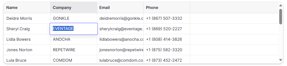
*The editor now works*
---
## Grid Columns
**URL:** https://ai-data-grid-docs.vercel.app/docs/extended-quickstart-guide/grid-columns
### Basic usage
> 💡 The `GridColumn[]` passed to the `DataEditor` in the `columns` property should be memoized to avoid excessive re-rendering. These samples may not do this for the sake of brevity.
There are only two mandatory properties for each `GridColumn`: `title` and `id`. The id should be a stable id and not the index of the column. Additionally a `width` property can be provided which represents the width of the column in pixels. If a width is provided the id may be omited. This may change in a future version.
```typescript
const columns: GridColumn[] = [
{ title: "First", id: "first", width: 150 },
{ title: "Second", id: "second", width: 150 }
];
```
*Two beautiful identically sized columns.*
### Header icons
Default header icons are available. They can also be reaplced by passing a new map to the `headerIcons` property.
```typescript
const columns: GridColumn[] = [
{ title: "Name", id: "name", width: 250, icon: GridColumnIcon.HeaderString,
overlayIcon: GridColumnIcon.RowOwnerOverlay
},
{ title: "Age", id: "age", width: 100, icon: GridColumnIcon.HeaderNumber },
{ title: "Avatar", id: "avatar", width: 80, icon: GridColumnIcon.HeaderImage },
];
```
*Lovely icons!*
### Header theming
Headers can be provided with individual theme overrides which themes both the header and its column cells.
```typescript
const columns: GridColumn[] = [
{ title: "Name", id="name", width: 250, icon: GridColumnIcon.HeaderString },
{ title: "Age", id="age", width: 100, icon: GridColumnIcon.HeaderNumber, themeOverride: {
bgIconHeader: "#00967d",
textDark: "#00c5a4",
textHeader: "#00c5a4",
} },
{ title: "Avatar", id="avatar", width: 80, icon: GridColumnIcon.HeaderImage },
];
```
*Lovely teal colors*
---
## Extended QuickStart Guide
**URL:** https://ai-data-grid-docs.vercel.app/docs/extended-quickstart-guide
---
## Working with selections
**URL:** https://ai-data-grid-docs.vercel.app/docs/extended-quickstart-guide/working-with-selections
AI Data Grid selections are controlled via the [`gridSelection`](/docs/api/dataeditor/selection-handling#gridselection) and [`onGridSelectionChanged`](/docs/api/dataeditor/selection-handling#ongridselectionchange) properties. To respond to selection changes the gridSelection must be controlled.
```tsx
const [selection, setSelection] = React.useState({
columns: CompactSelection.empty(),
rows: CompactSelection.empty(),
});
return
```
The [`GridSelection`](/docs/api/common-types#gridselection) contains three different elements. The current selection, the selected rows, and the selected columns.
```tsx
interface GridSelection {
readonly current?: {
readonly cell: Item;
readonly range: Readonly;
readonly rangeStack: readonly Readonly[];
};
readonly columns: CompactSelection;
readonly rows: CompactSelection;
}
```
The `current` part of the selection contains the selected `cell`. This is the item which will be drawn with a focus ring. The `range` represents the selected region around the cell that may be edited by certain commands such as delete. Finally, the `rangeStack` are additional ranges that the user has selected when [`multi-rect`](/docs/api/dataeditor/selection-handling#column-range-rowselect) selection mode is enabled.
`rows` and `columns` are both a `CompactSelection`. A compact selection is a sparse array designed to efficiently hold spans of selected elements. They have the following interface:
```typescript
export class CompactSelection
static empty(): CompactSelection;
static fromSingleSelection(selection: number | Slice): CompactSelection;
public offset(amount: number): CompactSelection;
public add(selection: number | Slice): CompactSelection;
public remove(selection: number | Slice): CompactSelection;
public first(): number | undefined;
public last(): number | undefined;
public hasIndex(index: number): boolean;
public hasAll(index: Slice): boolean;
public some(predicate: (index: number) => boolean): boolean;
public equals(other: CompactSelection): boolean;
public toArray(): number[];
get length(): number;
*[Symbol.iterator]()
}
```
In general, it is advisable not to call `toArray`. Iterating over the `CompactSelection` using a `for ... of` loop is significantly more efficient.
---
## Implementing Custom Cells
**URL:** https://ai-data-grid-docs.vercel.app/docs/guides/implementing-custom-cells
Coming soon. For now enjoy this custom cell which kind of explains the process.
```tsx
type CustomCell,
measureTextCached,
type CustomRenderer,
getMiddleCenterBias,
GridCellKind,
} from "@specstory/ai-data-grid";
interface RangeCellProps {
readonly kind: "range-cell";
readonly value: number;
readonly min: number;
readonly max: number;
readonly step: number;
readonly label?: string;
readonly measureLabel?: string;
readonly readonly?: boolean;
}
export type RangeCell = CustomCell;
const RANGE_HEIGHT = 6;
const inputStyle: React.CSSProperties = {
marginRight: 8,
};
const wrapperStyle: React.CSSProperties = {
display: "flex",
alignItems: "center",
flexGrow: 1,
};
const renderer: CustomRenderer = {
kind: GridCellKind.Custom,
isMatch: (c): c is RangeCell => (c.data as any).kind === "range-cell",
draw: (args, cell) => {
const { ctx, theme, rect } = args;
const { min, max, value, label, measureLabel } = cell.data;
const x = rect.x + theme.cellHorizontalPadding;
const yMid = rect.y + rect.height / 2;
const rangeSize = max - min;
const fillRatio = (value - min) / rangeSize;
ctx.save();
let labelWidth = 0;
if (label !== undefined) {
ctx.font = `12px ${theme.fontFamily}`; // fixme this is slow
labelWidth =
measureTextCached(measureLabel ?? label, ctx, `12px ${theme.fontFamily}`).width +
theme.cellHorizontalPadding;
}
const rangeWidth = rect.width - theme.cellHorizontalPadding * 2 - labelWidth;
if (rangeWidth >= RANGE_HEIGHT) {
const gradient = ctx.createLinearGradient(x, yMid, x + rangeWidth, yMid);
gradient.addColorStop(0, theme.accentColor);
gradient.addColorStop(fillRatio, theme.accentColor);
gradient.addColorStop(fillRatio, theme.bgBubble);
gradient.addColorStop(1, theme.bgBubble);
ctx.beginPath();
ctx.fillStyle = gradient;
roundedRect(ctx, x, yMid - RANGE_HEIGHT / 2, rangeWidth, RANGE_HEIGHT, RANGE_HEIGHT / 2);
ctx.fill();
ctx.beginPath();
roundedRect(
ctx,
x + 0.5,
yMid - RANGE_HEIGHT / 2 + 0.5,
rangeWidth - 1,
RANGE_HEIGHT - 1,
(RANGE_HEIGHT - 1) / 2
);
ctx.strokeStyle = theme.accentLight;
ctx.lineWidth = 1;
ctx.stroke();
}
if (label !== undefined) {
ctx.textAlign = "right";
ctx.fillStyle = theme.textDark;
ctx.fillText(
label,
rect.x + rect.width - theme.cellHorizontalPadding,
yMid + getMiddleCenterBias(ctx, `12px ${theme.fontFamily}`)
);
}
ctx.restore();
return true;
},
provideEditor: () => {
// eslint-disable-next-line react/display-name
return p => {
const { data } = p.value;
const strValue = data.value.toString();
const strMin = data.min.toString();
const strMax = data.max.toString();
const strStep = data.step.toString();
const onChange = (e: React.ChangeEvent) => {
p.onChange({
...p.value,
data: {
...data,
value: Number(e.target.value),
},
});
};
return (
);
};
},
onPaste: (v, d) => {
let num = Number.parseFloat(v);
num = Number.isNaN(num) ? d.value : Math.max(d.min, Math.min(d.max, num));
return {
...d,
value: num,
};
},
};
export default renderer;
```
---
## BaseGridCell
**URL:** https://ai-data-grid-docs.vercel.app/docs/api/cells/basegridcell
The `BaseGridCell` represents the common set of items all cells have. A cell is that which is generated from the [`getCellContent`](/docs/api/dataeditor/required-props#getcellcontent) callback and is the common language of communication in the `DataEditor`.
```typescript
export interface BaseGridCell {
readonly allowOverlay: boolean;
readonly lastUpdated?: number;
readonly style?: "normal" | "faded";
readonly themeOverride?: Partial;
readonly span?: readonly [start: number, end: number];
readonly contentAlign?: "left" | "right" | "center";
readonly cursor?: CSSProperties["cursor"];
readonly copyData?: string;
}
```
### allowOverlay
This enables or disables the overlay popup normally triggered by double clicking a cell. Disabling this does not prevent editing. Many cells have a `readonly` property for that.
### lastUpdated
A `performance.now()` relative timestamp that indicates when the cell was last updated. This triggers the `DataEditor` to render a flash of the cells background color indicating an update has happened.
### themeOverride
Overrides the theme of the cell. It is advisable to set your theme overries as high as possible in the tree. Overriding the cell theme is more expensive than a row theme, which is more expensive than a column theme.
### style
`faded` causes the cell to render with a slight transparency.
### contentAlign
A hint to the cell on where to align content. Not all cells respect this yet.
### cursor
An override of the cursor when the mouse is over the cell.
### copyData
Overrides the data the cell will copy into the paste buffer when the user tries to copy the cell.
###
---
## BooleanCell
**URL:** https://ai-data-grid-docs.vercel.app/docs/api/cells/booleancell
Renders a quad-state checkbox.
```typescript
export interface BooleanCell extends BaseGridCell {
readonly kind: GridCellKind.Boolean;
readonly data: boolean | BooleanEmpty | BooleanIndeterminate;
readonly readonly?: boolean;
readonly allowOverlay: false;
readonly maxSize?: number;
}
```
### data
Determines if the boolean cell is checked, unchecked, or empty.
### readonly
Determines if the cell will accept edit events.
### maxSize
Controls the maximum size the checkbox will become. So long as this is smaller that the cell size this will also represent the final size of the checkbox.
---
## BubbleCell
**URL:** https://ai-data-grid-docs.vercel.app/docs/api/cells/bubblecell
Renders text in bubbles. Always read only.
```typescript
export interface BubbleCell extends BaseGridCell {
readonly kind: GridCellKind.Bubble;
readonly data: string[];
}
```
### data
The text to display in bubbles.
---
## DrilldownCell
**URL:** https://ai-data-grid-docs.vercel.app/docs/api/cells/drilldowncell
Renders text and images in rounded rectangles. Always read only.
```typescript
export interface DrilldownCellData {
readonly text: string;
readonly img?: string;
}
export interface DrilldownCell extends BaseGridCell {
readonly kind: GridCellKind.Drilldown;
readonly data: readonly DrilldownCellData[];
}
```
### data
A collection of text/image tuples.
---
## ImageCell
**URL:** https://ai-data-grid-docs.vercel.app/docs/api/cells/imagecell
Renders one or more images.
```typescript
export interface ImageCell extends BaseGridCell {
readonly kind: GridCellKind.Image;
readonly data: string[];
readonly rounding?: number;
readonly displayData?: string[];
readonly readonly?: boolean;
}
```
### displayData
Reduced size image URLs for display in the grid. It is advisable to pass pre-scaled images to the grid to reduce scrolling and network overhead.
### data
Full size image URLs.
### readonly
Determines if the cell will accept new images.
### rounding
Controls the amount of rounding applied to the images. If set to 0, no rounding will be applied.
---
## Cells
**URL:** https://ai-data-grid-docs.vercel.app/docs/api/cells
---
## LoadingCell
**URL:** https://ai-data-grid-docs.vercel.app/docs/api/cells/loadingcell
Loading cells are for rendering content that is still loading from the server. They have no additional properties.
```typescript
export interface LoadingCell extends BaseGridCell {
readonly kind: GridCellKind.Loading;
readonly skeletonWidth?: number;
readonly skeletonHeight?: number;
readonly skeletonWidthVariability?: number;
}
```
### skeletonWidth
Determines the width in pixels of the skeleton to be drawn. If set to 0 no skeleton will draw.
### skeletonHeight
Determines the height in pixels of the skeleton to be drawn. If set to 0 no skeleton will draw.
### skeletonWidthVariability
The skeleton variability is a width in pixels that is multiplied by a random number between 0 and 1 and added to the skeleton width to produce the final skeleton width.
---
## MarkdownCell
**URL:** https://ai-data-grid-docs.vercel.app/docs/api/cells/markdowncell
Renders markdown in the overlay editor.
```typescript
export interface MarkdownCell extends BaseGridCell {
readonly kind: GridCellKind.Markdown;
readonly data: string;
readonly readonly?: boolean;
}
```
### data
Markdown.
### readonly
Determines if the cell will accept edit events.
---
## NumberCell
**URL:** https://ai-data-grid-docs.vercel.app/docs/api/cells/numbercell
The number cell renders numbers and has a specialized editor for inputing numerical values.
```typescript
export interface NumberCell extends BaseGridCell {
readonly kind: GridCellKind.Number;
readonly displayData: string;
readonly data: number | undefined;
readonly readonly?: boolean;
readonly fixedDecimals?: number;
readonly allowNegative?: boolean;
readonly thousandSeparator?: boolean | string;
readonly decimalSeparator?: string;
}
```
### displayData
A formated version of the number as a string.
### data
The number value of the cell
### readonly
Determines if the cell will accept edit events.
### fixedDecimals
When provided, fixes the number of decimals used in the overlay editor to the number provided.
### allowNegative
When set to `false` negative numbers are not allowed to be entered.
### thousandsSeparator
Allows overiding or disabling of the thousands separator. False disables, true enables, and a string overrides it.
### decimalSeparator
Allows overiding the decimal separator, normally passing either "," or "."
---
## ProtectedCell
**URL:** https://ai-data-grid-docs.vercel.app/docs/api/cells/protectedcell
Protected cells are for rendering content that is obscured from the user. They have no additional properties.
```typescript
export interface ProtectedCell extends BaseGridCell {
readonly kind: GridCellKind.Protected;
}
```
---
## RowIDCell
**URL:** https://ai-data-grid-docs.vercel.app/docs/api/cells/rowidcell
Renders a faded out text representation of a RowID
```typescript
export interface RowIDCell extends BaseGridCell {
readonly kind: GridCellKind.RowID;
readonly data: string;
readonly readonly?: boolean;
}
```
### data
The string representation of the RowID
### readonly
Determines if the cell will accept edit events.
---
## TextCell
**URL:** https://ai-data-grid-docs.vercel.app/docs/api/cells/textcell
The text cell renders text. It can also render multiple lines of text.
```typescript
export interface TextCell extends BaseGridCell {
readonly kind: GridCellKind.Text;
readonly displayData: string;
readonly data: string;
readonly readonly?: boolean;
readonly allowWrapping?: boolean;
}
```
### displayData
The text to display to the user when the overlay editor is closed. Usually the same as `data` unless formatting is needed.
### data
The text to display to the user when the overlay editor is open.
### readonly
Determines if the cell will accept edit events.
### allowWrapping
If enabled the cell will render with text top aligned and will allow for rendering multiple lines of text. By default the text cell only renders a single line of text.
---
## UriCell
**URL:** https://ai-data-grid-docs.vercel.app/docs/api/cells/uricell
Renders URIs (usually urls) with the optional direct interaction.
```typescript
export interface UriCell extends BaseGridCell {
readonly kind: GridCellKind.Uri;
readonly data: string;
readonly displayData?: string;
readonly readonly?: boolean;
readonly onClickUri?: (args: BaseGridMouseEventArgs & { readonly preventDefault: () => void }) => void;
readonly hoverEffect?: boolean;
}
```
### displayData
A formated version of the uri as a string.
### data
The uri
### readonly
Determines if the cell will accept edit events.
### hoverEffect
If set to true the uri will underline when hovered and receive a pointer cursor.
### onClickUri
If provided this will be called whenever the actual text of the uri cell is clicked. This can be used to open a url.
---
## Custom Cells
**URL:** https://ai-data-grid-docs.vercel.app/docs/api/dataeditor/custom-cells
```typescript
interface DataEditorProps {
// ...other props
customRenderers?: readonly CustomRenderer[];
drawCell?: DrawCellCallback;
drawHeader?: DrawHeaderCallback;
// ...other props
}
```
***
### customRenderers
```typescript
customRenderers?: readonly CustomRenderer[];
```
Adds custom renderers to the `DataEditor`. Each renderer provides its own drawing functionality and editor. See [Implementing Custom Cells](/docs/guides/implementing-custom-cells) for more information.
### drawCell
```ts
drawCell?: (
args: {
ctx: CanvasRenderingContext2D;
cell: GridCell;
theme: Theme;
rect: Rectangle;
col: number;
row: number;
hoverAmount: number;
hoverX: number | undefined;
hoverY: number | undefined;
highlighted: boolean;
imageLoader: ImageWindowLoader;
},
drawContent: () => void
) => void;
```
The `drawCell` property enables custom rendering of cells in the Grid. This function is called for each cell during the rendering process and is provided with a comprehensive set of parameters. These parameters include the drawing context (`ctx`), cell data (`cell`), theming details (`theme`), the cell's rectangle (`rect`), column and row indices (`col`, `row`), hover state information (`hoverAmount`, `hoverX`, `hoverY`), a highlight flag (`highlighted`), and an image loader (`imageLoader`).
Additionally, `drawCell` provides a `drawContent` method, which, when called, immediately draws the default content of the cell onto the canvas. This design offers flexibility in how you render each cell. For instance, you can first draw a custom background, then call `drawContent` to render the cell's standard contents, and finally add an overlay or additional embellishments. This approach allows for layered rendering, where you can seamlessly integrate custom graphics or styles with the grid's inherent rendering logic.
***
### drawHeader
```ts
drawHeader?: (args: {
ctx: CanvasRenderingContext2D;
column: GridColumn;
columnIndex: number;
theme: Theme;
rect: Rectangle;
hoverAmount: number;
isSelected: boolean;
isHovered: boolean;
hasSelectedCell: boolean;
spriteManager: SpriteManager;
menuBounds: Rectangle;
},
drawContent: () => void
) => void;
```
`drawHeader` may be specified to override the rendering of a header. The grid will call this for every header it needs to render. Header rendering is not as well optimized because they do not redraw as often, but very heavy drawing methods can negatively impact horizontal scrolling performance.
---
## Drag and Drop
**URL:** https://ai-data-grid-docs.vercel.app/docs/api/dataeditor/drag-and-drop
```typescript
interface DataEditorProps {
onDragLeave?: (() => void);
onDragOverCell?: ((cell: Item, dataTransfer: DataTransfer | null) => void);
onDrop?: ((cell: Item, dataTransfer: DataTransfer | null) => void);
}
```
***
### onDragLeave
```typescript
onDragLeave?: (() => void);
```
Emitted when the external drag event leaves the data editor.
***
### onDragOverCell
```typescript
onDragOverCell?: ((cell: Item, dataTransfer: DataTransfer | null) => void);
```
Emitted when the external drag event enters a new cell in the grid.
***
### onDrop
```typescript
onDrop?: ((cell: Item, dataTransfer: DataTransfer | null) => void);
```
Emitted when the external drag is dropped onto a valid target inside of the grid.
***
---
## Editing
**URL:** https://ai-data-grid-docs.vercel.app/docs/api/dataeditor/editing
In general editing in the `DataEditor` is handled by listening to the `onCellEdited` or `onCellsEdited` events and updating your data source. Once an edit is complete the `DataEditor` will automatically re-render those cells. If the edits to the data source are synchronous, meaning subsequent calls to `getCellContent` return the edited values, the `DataEditor` will automatically reflect the new values.
Additional events are available for specialty purposes.
```typescript
interface DataEditorProps {
// ...other props
coercePasteValue?: ((val, cell) => undefined | GridCell);
imageEditorOverride?: ImageEditorType;
onCellEdited?: ((cell, newValue) => void);
onCellsEdited?: ((newValues) => boolean | void);
onDelete?: ((selection) => boolean | GridSelection);
onFillPattern?: ((event) => void);
onFinishedEditing?: ((newValue, movement) => void);
onGroupHeaderRenamed?: ((groupName, newVal) => void);
onPaste?: boolean | ((target, values) => boolean);
onRowAppended?: (() => void | Promise);
trailingRowOptions?: {
addIcon?: string;
hint?: string;
sticky?: boolean;
targetColumn?: number | GridColumn;
tint?: boolean;
};
validateCell?: ((cell, newValue, prevValue) => boolean | ValidatedGridCell);
// ...other props
}
```
### onDelete
```ts
onDelete?: (selection: GridSelection) => GridSelection | boolean;
```
`onDelete` is called when the user deletes one or more rows. `gridSelection` is current selection. If the callback returns false, deletion will not happen. If it returns true, all cells inside all selected rows, columns and ranges will be deleted. If the callback returns a GridSelection, the newly returned selection will be deleted instead.
***
### imageEditorOverride
```ts
imageEditorOverride?: ImageEditorType;
```
If `imageEditorOverride` is specified, then it will be used instead of the default image editor overlay, which is what the user sees when they double-click on an image cell.
***
### onCellEdited
```ts
onCellEdited?: (cell: Item, newValue: EditableGridCell) => void;
onCellsEdited?: (newValues: readonly { location: Item; value: EditableGridCell }[]) => boolean | void;
```
`onCellEdited` is called when the user finishes editing a cell. Note that you are responsible for setting the new value of the cell.
`onCellsEdited` is called whenever a batch of cells is about to be edited. If the callback returns `true`, `onCellEdited` will not be called for an cells in the event.
***
### onDeleteRows
```ts
onDeleteRows?: (rows: readonly number[]) => void;
```
`onDeleteRows` is called when the user deletes one or more rows. `rows` is an array with the absolute indexes of the deletes rows. Note that it is on you to actually effect the deletion of those rows.
***
### onFillPattern
```typescript
interface FillPatternEventArgs extends PreventableEvent {
patternSource: Rectangle;
fillDestination: Rectangle;
}
onFillPattern?: ((event: FillPatternEventArgs ) => void);
```
Emitted whenever the user uses the `fillHandle` to fill other cells with data. The `patternSource` represents the selection from which the fill started, and the `fillDestination` represents the region to be filled using the pattern as a template. `event.preventDefault()` may be called in order to prevent the standard fill behavior from happening.
***
### onFinishedEditing
```ts
onFinishedEditing?: (newValue: GridCell | undefined, movement: Item) => void;
```
Emitted whenever the data grid exits edit mode. The movement indicates which direction the user requested the selection move towards. `-1` is left/up, `1` is right/down.
***
### onGroupHeaderRenamed
```ts
onGroupHeaderRenamed?: (groupName: string, newVal: string) => void
```
If provided group headers will have an icon allowing users to rename them. When a user renames a group header this event will be emitted. It is up to the developer to actually rename the header.
***
### onPaste
```ts
onPaste?: ((target: Item, values: readonly (readonly string[])[]) => boolean) | boolean;
```
`onPaste` is called when data is pasted into the grid. If left undefined, the `DataEditor` will operate in a fallback mode and attempt to paste the text buffer into the current cell assuming the current cell is not readonly and can accept the data type. If `onPaste` is set to false or the function returns false, the grid will simply ignore paste. If `onPaste` evaluates to true the grid will attempt to split the data by tabs and newlines and paste into available cells.
The grid will not attempt to add additional rows if more data is pasted then can fit. In that case it is advisable to simply return false from onPaste and handle the paste manually.
***
### coercePasteValue
```ts
coercePasteValue?: (val: string, cell: GridCell) => GridCell | undefined;
```
This callback allows coercion of pasted values before they are passed to edit functions. `val` contains the pasted value and `cell` is the target of the paste. Returning `undefined` will accept the default behavior of the grid, or a `GridCell` may be returned which will be used for paste instead.
***
### trailingRowOptions
```ts
trailingRowOptions?: {
readonly tint?: boolean; // DataEditor level only
readonly sticky?: boolean; // DataEditor level only
readonly hint?: string;
readonly addIcon?: string;
readonly targetColumn?: number | GridColumn;
readonly themeOverride?: Partial; // GridColumn only
readonly disabled?: boolean; // GridColumn only
}
onRowAppended?: () => void;
```
`onRowAppended` is called when the user asks for a new row, and is responsible for appending it. The grid calls it when the user clicks a cell of the trailing blank row, and when the user finishes editing a cell in the last row and moves down (for example with Enter) while no trailing row is shown. The trailing blank row is shown only when `trailingRowOptions` is set, which also configures its appearance; an empty object (`{}`) is enough. Setting `onRowAppended` alone doesn't show it.
***
### validateCell
```ts
readonly validateCell?: (cell: Item, newValue: EditableGridCell) => boolean | EditableGridCell;
```
When returns false indicates to the user the value will not be accepted. When returns a new GridCell the value is coerced to match.
---
## Important Props
**URL:** https://ai-data-grid-docs.vercel.app/docs/api/dataeditor/important-props
Most data grids will want to some of these props one way or another.
```typescript
interface DataEditorProps {
// ...other props
fixedShadowX?: boolean;
fixedShadowY?: boolean;
freezeColumns?: number;
freezeTrailingRows?: number;
getCellsForSelection?: true | ((selection, abortSignal) => GetCellsThunk | CellArray);
height?: string | number;
markdownDivCreateNode?: ((content) => DocumentFragment);
onVisibleRegionChanged?: ((range, tx, ty, extras) => void);
provideEditor?: ProvideEditorCallback;
rowHeight?: number | ((index) => number);
smoothScrollX?: boolean;
smoothScrollY?: boolean;
width?: string | number;
// ...other props
}
```
***
### fixedShadow
```ts
fixedShadowX?: boolean;
fixedShadowY?: boolean;
```
Controls shadows behind fixed columns and header rows. Defaults to `true`. This can make freeze columns hard to read if vertical borders are also disabled.
***
### freezeColumns
```ts
freezeColumns?: number;
```
Set to a positive number to freeze columns on the left side of the grid during horizontal scrolling.
***
### freezeTrailingRows
Set to a positive number to freeze rows on the bottom of the grid during vertical scrolling.
***
### getCellsForSelection
```ts
type CellArray = readonly (readonly GridCell[])[];
type GetCellsThunk = () => Promise;
getCellsForSelection?: true | (selection: Rectangle) => CellArray | GetCellsThunk;
```
`getCellsForSelection` is called when the user copies a selection to the clipboard or the data editor needs to inspect data which may be outside the curently visible range. It must return a two-dimensional array (an array of rows, where each row is an array of cells) of the cells in the selection's rectangle. Note that the rectangle can include cells that are not currently visible.
If `true` is passed instead of a callback, the data grid will internally use the `getCellContent` callback to provide a basic implementation of `getCellsForSelection`. This can make it easier to light up more data grid functionality, but may have negative side effects if your data source is not able to handle being queried for data outside the normal window.
If `getCellsForSelection` returns a thunk, the data may be loaded asynchronously, however the data grid may be unable to properly react to column spans when performing range selections. Copying large amounts of data out of the grid will depend on the performance of the thunk as well.
***
### markdownDivCreateNode
```ts
markdownDivCreateNode?: (content: string) => DocumentFragment;
```
If `markdownDivCreateNode` is specified, then it will be used to render Markdown, instead of the default Markdown renderer used by the Grid. You'll want to use this if you need to process your Markdown for security purposes, or if you want to use a renderer with different Markdown features.
***
### onVisibleRegionChanged
```ts
onVisibleRegionChanged?: (
range: Rectangle,
tx: number,
ty: number,
extras: { selected?: Item; freezeRegion?: Rectangle };
) => void;
```
`onVisibleRegionChanged` is called whenever the visible region changed. The new visible region is passed as a `Rectangle`. The x and y transforms of the cell region are passed as `tx` and `ty`. The current selection and frozen region are passed in the `extras` object.
***
### provideEditor
```ts
export type ProvideEditorComponent = React.FunctionComponent<{
readonly onChange: (newValue: T) => void;
readonly onFinishedEditing: (newValue?: T, movement?: readonly [-1 | 0 | 1, -1 | 0 | 1]) => void;
readonly isHighlighted: boolean;
readonly value: T;
readonly initialValue?: string;
readonly validatedSelection?: SelectionRange;
readonly imageEditorOverride?: ImageEditorType;
readonly markdownDivCreateNode?: (content: string) => DocumentFragment;
readonly target: Rectangle;
readonly forceEditMode: boolean;
readonly isValid?: boolean;
}>;
export type ProvideEditorCallbackResult =
| (ProvideEditorComponent & {
disablePadding?: boolean;
disableStyling?: boolean;
})
| ObjectEditorCallbackResult
| undefined;
export type ProvideEditorCallback = (cell: T) => ProvideEditorCallbackResult;
provideEditor?: ProvideEditorCallback;
```
When provided the `provideEditor` callbacks job is to be a constructor for functional components which have the correct properties to be used by the data grid as an editor. The editor must implement `onChange` and `onFinishedEditing` callbacks as well support the `isHighlighted` flag which tells the editor to begin with any editable text pre-selected so typing will immediately begin to overwrite it.
***
### rowHeight
```ts
rowHeight: number | ((index: number) => number);
```
`rowHeight` is the height of a row in the table. It defaults to `34`. By passing a function instead of a number you can give different heights to each row. The `index` is the zero-based absolute row index.
***
### smoothScroll
```ts
smoothScrollX?: boolean;
smoothScrollY?: boolean;
```
Controls smooth scrolling in the data grid. Defaults to `false`. If smooth scrolling is not enabled the grid will always be cell aligned in the non-smooth scrolling axis.
***
### width/height
```typescript
width?: string | number;
height?: string | number;
```
`width` and `height` override the default size of the grid. These accept any valid width/height string. If a number is provided it is interpreted as pixels.
---
## DataEditor
**URL:** https://ai-data-grid-docs.vercel.app/docs/api/dataeditor
---
## Input Interaction
**URL:** https://ai-data-grid-docs.vercel.app/docs/api/dataeditor/input-interaction
```typescript
interface DataEditorProps {
// ...other props
keybindings?: Partial;
maxColumnAutoWidth?: number;
maxColumnWidth?: number;
minColumnWidth?: number;
onCellActivated?: ((cell) => void);
onCellClicked?: ((cell, event) => void);
onCellContextMenu?: ((cell, event) => void);
onColumnMoved?: ((startIndex, endIndex) => void);
onColumnResize?: ((column, newSize, colIndex, newSizeWithGrow) => void);
onColumnResizeEnd?: ((column, newSize, colIndex, newSizeWithGrow) => void);
onColumnResizeStart?: ((column, newSize, colIndex, newSizeWithGrow) => void);
onGroupHeaderClicked?: ((colIndex, event) => void);
onGroupHeaderContextMenu?: ((colIndex, event) => void);
onGroupHeaderRenamed?: ((groupName, newVal) => void);
onHeaderClicked?: ((colIndex, event) => void);
onHeaderContextMenu?: ((colIndex, event) => void);
onHeaderMenuClick?: ((col, screenPosition) => void);
onItemHovered?: ((args) => void);
onKeyDown?: ((event) => void);
onKeyUp?: ((event) => void);
onMouseMove?: ((args) => void);
onRowMoved?: ((startIndex, endIndex) => void);
preventDiagonalScrolling?: boolean;
rowSelectionMode?: "auto" | "multi";
// ...other props
}
```
***
### keybindings
```typescript
keybindings?: Partial<{
// Legacy deprecated flags
readonly pageUp: boolean;
readonly pageDown: boolean;
readonly first: boolean;
readonly last: boolean;
// Non-rebindable
readonly copy: boolean;
readonly cut: boolean;
readonly paste: boolean;
readonly downFill: boolean | string;
readonly rightFill: boolean | string;
readonly clear: boolean | string;
readonly closeOverlay: boolean | string;
readonly acceptOverlayDown: boolean | string;
readonly acceptOverlayUp: boolean | string;
readonly acceptOverlayLeft: boolean | string;
readonly acceptOverlayRight: boolean | string;
readonly search: boolean | string;
readonly delete: boolean | string;
readonly activateCell: boolean | string;
readonly scrollToSelectedCell: boolean | string;
// Navigation
readonly goToFirstColumn: boolean | string;
readonly goToLastColumn: boolean | string;
readonly goToFirstCell: boolean | string;
readonly goToLastCell: boolean | string;
readonly goToFirstRow: boolean | string;
readonly goToLastRow: boolean | string;
readonly goToNextPage: boolean | string;
readonly goToPreviousPage: boolean | string;
readonly goUpCell: boolean | string;
readonly goDownCell: boolean | string;
readonly goLeftCell: boolean | string;
readonly goRightCell: boolean | string;
readonly goUpCellRetainSelection: boolean | string;
readonly goDownCellRetainSelection: boolean | string;
readonly goLeftCellRetainSelection: boolean | string;
readonly goRightCellRetainSelection: boolean | string;
// Selectiona
readonly selectToFirstColumn: boolean | string;
readonly selectToLastColumn: boolean | string;
readonly selectToFirstCell: boolean | string;
readonly selectToLastCell: boolean | string;
readonly selectToFirstRow: boolean | string;
readonly selectToLastRow: boolean | string;
readonly selectGrowUp: boolean | string;
readonly selectGrowDown: boolean | string;
readonly selectGrowLeft: boolean | string;
readonly selectGrowRight: boolean | string;
readonly selectAll: boolean | string;
readonly selectRow: boolean | string;
readonly selectColumn: boolean | string;
}>;
```
| Key Combo | Default | Flag | Description |
| --- | --- | --- | --- |
| Arrow | ✔️ | N/A | Moves the currently selected cell and clears other selections |
| Shift + Arrow | ✔️ | N/A | Extends the current selection range in the direction pressed. |
| Alt + Arrow | ✔️ | N/A | Moves the currently selected cell and retains the current selection |
| Ctrl/Cmd + Arrow \| Home/End | ✔️ | N/A | Move the selection as far as possible in the direction pressed. |
| Ctrl/Cmd + Shift + Arrow | ✔️ | N/A | Extends the selection as far as possible in the direction pressed. |
| Shift + Home/End | ✔️ | N/A | Extends the selection as far as possible in the direction pressed. |
| Ctrl/Cmd + A | ✔️ | `selectAll` | Selects all cells. |
| Shift + Space | ✔️ | `selectRow` | Selecs the current row. |
| Ctrl + Space | ✔️ | `selectCol` | Selects the current col. |
| PageUp/PageDown | ✔️ | `pageUp`/`pageDown` | Moves the current selection up/down by one page. |
| Escape | ✔️ | `clear` | Clear the current selection. |
| Ctrl/Cmd + D | ❌ | `downFill` | Data from the first row of the range will be down filled into the rows below it |
| Ctrl/Cmd + R | ❌ | `rightFill` | Data from the first column of the range will be right filled into the columns next to it |
| Ctrl/Cmd + C | ✔️ | `copy` | Copies the current selection. |
| Ctrl/Cmd + V | ✔️ | `paste` | Pastes the current buffer into the grid. |
| Ctrl/Cmd + F | ❌ | `search` | Opens the search interface. |
| Ctrl/Cmd + Home/End | ✔️ | `first`/`last` | Move the selection to the first/last cell in the data grid. |
| Ctrl/Cmd + Shift + Home/End | ✔️ | `first`/`last` | Extend the selection to the first/last cell in the data grid. |
***
### maxColumnWidth
```ts
maxColumnWidth?: number;
minColumnWidth?: number;
```
If `maxColumnWidth` is set with a value greater than 50, then columns will have a maximum size of that many pixels. If the value is less than 50, it will be increased to 50. If it isn't set, the default value will be 500.
***
### maxColumnAutoWidth
```ts
maxColumnAutoWidth?: number;
```
Sets the maximum width that a column can be auto-sized to. Defaults to [`maxColumnWidth`](#maxcolumnwidth).
***
### onCellClicked
```ts
onCellClicked?: (cell: Item) => void;
```
`onCellClicked` is called whenever the user clicks a cell in the grid.
***
### onCellActivated
```ts
onCellActivated?: (cell: Item) => void;
```
`onCellActivated` is called whenever the user double clicks, taps Enter, or taps Space on a cell in the grid.
***
### onCellContextMenu
***
### onColumnMoved
```ts
onColumnMoved?: (startIndex: number, endIndex: number) => void;
```
`onColumnMoved` is called when the user finishes moving a column. `startIndex` is the index of the column that was moved, and `endIndex` is the index at which it should end up. Note that you have to effect the move of the column, and pass the reordered columns back in the `columns` property.
***
### onColumnResize
```ts
onColumnResize?: (column: GridColumn, newSize: number, columnIndex: number) => void;
onColumnResizeEnd?: (column: GridColumn, newSize: number, columnIndex: number) => void;
```
`onColumnResize` is called when the user is resizing a column. `newSize` is the new size of the column. Note that you have change the size of the column in the `GridColumn` and pass it back to the grid in the `columns` property. `onColumnReizeEnd` is called with the same arguments, but only once the user ceases interaction with the resize handle.
### onColumnResizeStart
```ts
onColumnResizeStart?: (column: GridColumn, newSize: number, columnIndex: number) => void;
```
`onColumnResizeStart` is called when the user starts resizing a column. `newSize` is the new size of the column.
### onColumnResizeEnd
```ts
onColumnResizeEnd?: (column: GridColumn, newSize: number, columnIndex: number) => void;
```
`onColumnResize` is called when the user ends resizing a column. `newSize` is the new size of the column.
***
### onGroupHeaderClicked
```ts
onGroupHeaderClicked?: (colIndex: number, event: GroupHeaderClickedEventArgs) => void;
```
Emitted whenever a group header is clicked.
***
### onGroupHeaderContextMenu
```ts
onGroupHeaderContextMenu?: (colIndex: number, event: GroupHeaderClickedEventArgs) => void
```
Emitted whenever a group header's context menu should be presented, usually right click.
***
### onHeaderClicked
```ts
onHeaderClicked?: (colIndex: number, event: HeaderClickedEventArgs) => void;
```
Emitted whenever a header is clicked.
***
### onHeaderContextMenu
```ts
onHeaderContextMenu?: (colIndex: number, event: HeaderClickedEventArgs) => void;
```
Emitted whenever a column header's context menu should be presented, usually right click.
***
### onHeaderMenuClick
```ts
onHeaderMenuClick?: (col: number, screenPosition: Rectangle) => void;
```
`onHeaderMenuClick` is called when the user clicks the menu button on a column header. `col` is the column index, and `screenPosition` is the bounds of the column header. You are responsible for drawing and handling the menu.
***
### onItemHovered
```ts
onItemHovered?: (args: GridMouseEventArgs) => void;
```
`onItemHovered` is called when the user hovers over a cell, a header, or outside the grid.
***
### onMouseMove
```ts
onMouseMove?: (args: GridMouseEventArgs) => void;
```
Emitted any time the mouse moves. Most behaviors relying on this should be debounced for performance reasons.
***
### onRowMoved
```ts
onRowMoved?: (startIndex: number, endIndex: number) => void;
```
Called whenever a row re-order operation is completed. Setting the callback enables re-ordering by dragging the first column of a row.
***
### preventDiagonalScrolling
```ts
preventDiagonalScrolling?: booling;
```
Set to true to prevent any diagonal scrolling.
***
### rowSelectionMode
```ts
rowSelectionMode?: "auto" | "multi";
```
`rowSelectionMode` changes how selecting a row marker behaves. In auto mode it adapts to touch or mouse environments automatically, in multi-mode it always acts as if the multi key (Ctrl) is pressed.
***
### validateCell
```ts
readonly validateCell?: (cell: Item, newValue: EditableGridCell) => boolean | EditableGridCell;
```
When returns false indicates to the user the value will not be accepted. When returns a new GridCell the value is coerced to match.
---
## Required Props
**URL:** https://ai-data-grid-docs.vercel.app/docs/api/dataeditor/required-props
```typescript
interface DataEditorProps {
// ... other props
columns: readonly GridColumn[];
getCellContent: ((cell) => GridCell);
rows: number;
// ... other props
}
```
***
### columns
```ts
columns: readonly GridColumn[];
```
`columns` is an array of objects of type `GridColumn` describing the column headers. The length of the array is the number of columns to display.
> 💡 This value should be memoized so as to avoid extraneous rerendering.
***
### rows
```ts
rows: number;
```
`rows` is the number of rows to display.
***
### getCellContent
```ts
getCellContent: (cell: Item) => GridCell;
```
`getCellContent` returns an object of type `GridCell` describing the contents for the cell at the given coordinates.
> 💡 This value should be memoized so as to avoid extraneous rerendering. This is usually done using `React.useCallback`. Failure to ensure proper memoization will result in slow path rendering at all times.
---
## Row Markers
**URL:** https://ai-data-grid-docs.vercel.app/docs/api/dataeditor/row-markers
Row markers display the current index of the row as well as provide a means to select and reorder rows when configured. Rows markers are always marked as freeze columns and will always display regardless of horizontal scroll position.
*Row markers in action*
```typescript
interface DataEditorProps {
// ...other props
rowMarkers?: "number" | "none" | "checkbox" | "both" | "checkbox-visible" | "clickable-number";
rowMarkerStartIndex?: number;
rowMarkerTheme?: Partial;
rowMarkerWidth?: number;
// ...other props
}
```
***
### rowMarkers
```ts
rowMarkers?: "checkbox" | "number" | "both" | "none";
```
`rowMarkers` determines whether to display the marker column on the very left. It defaults to `none`. Note that this column doesn't count as a table column, i.e. it has no index, and doesn't change column indexes.
***
### rowMarkerStartIndex
```ts
rowMarkerStartIndex?: number;
```
This property is used to set the starting index for row markers in a React component. The `rowMarkerStartIndex` accepts a numerical value that specifies the initial index from which the row markers in the data grid will begin counting. By default, this value is set to `1`. This property is particularly useful when you need the row numbering to start from a specific value other than the default, such as when displaying paginated data or aligning with an external data set's indexing.
***
### rowMarkerTheme
```typescript
rowMarkerTheme?: Partial;
```
The `rowMarkerTheme` overrides the theme used for the row marker column. This is commonly used to tint the background of the row marker row and sometimes to fade them out a bit.
***
### rowMarkerWidth
```ts
rowMarkerWidth?: number;
```
`rowMarkerWidth` is the width of the marker column on the very left. By default, it adapts based on the number of rows in your data set.
---
## Search
**URL:** https://ai-data-grid-docs.vercel.app/docs/api/dataeditor/search
```typescript
interface DataEditorProps {
// ...other props
onSearchClose?: (() => void);
onSearchResultsChanged?: ((results, navIndex) => void);
onSearchValueChange?: ((newVal) => void);
searchResults?: readonly Item[];
searchValue?: string;
showSearch?: boolean;
// ...other props
}
```
***
### onSearchClose
```ts
onSearchClose?: () => void;
```
If `onSearchClose` is not provided and `showSearch` is set to true, the search box will be shown but there will be no close button. Providing an `onSearchClose` callback enables the close button and the event will emit when it is clicked.
***
### onSearchResultsChanged
```ts
readonly onSearchResultsChanged?: (results: readonly Item[], navIndex: number) => void;
```
This event handler is called when there is a change in the search results of the data grid's search field. It provides two parameters: `results` and `navIndex`. The `results` parameter is an array of `Item` objects, each representing a cell or row that matches the current search query. The `navIndex` parameter is the index of the currently selected or highlighted search result within the `results` array.
***
### onSearchValueChange
```ts
readonly onSearchValueChange?: (newVal: string) => void;
```
This event is emitted whenever the search value in the data grid changes. The handler `onSearchValueChange` is provided with a single argument `newVal`, which is the updated string value entered in the search field. Implementing this event allows you to execute custom actions in response to changes in the search input. This can include triggering search operations based on the new value, updating the user interface elements to reflect the change, or any other related functionality that needs to respond to updates in the search term within your data grid.
***
### searchResults
```ts
readonly searchResults?: readonly Item[];
```
This property allows you to specify the search results to be displayed in the data grid. If `searchResults` is not provided, the grid will use its internal search provider to determine and display search results. By setting the `searchResults` property, you can override the default search behavior and supply a custom array of `Item` objects as the search results. These `Item` objects typically refer to the cells or rows in the grid that match a custom search criterion. This is particularly useful if you need to implement a specialized search functionality that differs from the built-in search capabilities of the grid.
***
### searchValue
```ts
readonly searchValue?: string;
```
This property is used to set the current search value in the data grid. It accepts a string that represents the term or phrase to be used for searching within the grid. By setting `searchValue`, you can programmatically control the search value.
***
### showSearch
```ts
showSearch?: boolean;
```
`showSearch` causes the search box built into the data grid to become visible. The data grid does not provide an in-built way to show the search box, so it is suggested to hook into the ctrl/cmd+f accelerator or add a button to your apps chrome.
---
## Selection Handling
**URL:** https://ai-data-grid-docs.vercel.app/docs/api/dataeditor/selection-handling
```typescript
interface DataEditorProps {
// ...other props
columnSelect?: "none" | "single" | "multi";
columnSelectionBlending?: SelectionBlending;
drawFocusRing?: boolean;
fillHandle?: boolean;
gridSelection?: GridSelection;
highlightRegions?: readonly Highlight[];
onGridSelectionChange?: ((newSelection) => void);
onSelectionCleared?: (() => void);
rangeSelect?: "rect" | "none" | "cell" | "multi-cell" | "multi-rect";
rangeSelectionBlending?: SelectionBlending;
rowSelect?: "none" | "single" | "multi";
rowSelectionBlending?: SelectionBlending;
spanRangeBehavior?: "default" | "allowPartial";
// ...other props
}
```
***
### column/range/rowSelect
```ts
rangeSelect?: "none" | "cell" | "rect" | "multi-cell" | "multi-rect"; // default rect
columnSelect?: "none" | "single" | "multi"; // default multi
rowSelect?: "none" | "single" | "multi"; // default multi
```
Controls if multi-selection is allowed. If disabled, shift/ctrl/command clicking will work as if no modifiers are pressed.
When range select is set to cell, only one cell may be selected at a time. When set to rect one one rect at a time. The multi variants allow for multiples of the rect or cell to be selected.
***
### column/range/rowSelectionBlending
```ts
rangeSelectionBlending?: "exclusive" | "mixed"; // default exclusive
columnSelectionBlending?: "exclusive" | "mixed"; // default exclusive
rowSelectionBlending?: "exclusive" | "mixed"; // default exclusive
```
Controls which types of selections can exist at the same time in the grid. If selection blending is set to exclusive, the grid will clear other types of selections when the exclusive selection is made. By default row, column, and range selections are exclusive.
***
### drawFocusRing
```typescript
drawFocusRing?: boolean;
```
Controls drawing of the focus ring. If disabled the user will not easily see the selection.
***
### highlightRegions
```ts
interface Highlight {
readonly color: string;
readonly range: Rectangle;
}
highlightRegions?: readonly Highlight[];
```
Highlight regions are regions on the grid which get drawn with a background color and a dashed line around the region. The color string must be css parseable and the opacity will be removed for the drawing of the dashed line. Opacity should be used to allow overlapping selections to properly blend in background colors.
***
### fillHandle
```ts
fillHandle?: boolean;
```
Controls the visibility of the fill handle used for filling cells with the mouse.
***
### gridSelection
`GridSelection` is the most basic representation of the selected cells, rows, and columns in the data grid. The `current` property accounts for the selected cell and the range of cells selected as well. It is the selection which is modified by keyboard and mouse interaction when clicking on the cells themselves.
The `rows` and `columns` properties both account for the columns or rows which have been explicitly selected by the user. Selecting a range which encompases the entire set of cells within a column/row does not implicitly set it into this part of the collection. This allows for distinguishing between cases when the user wishes to delete all contents of a row/column and delete the row/column itself.
```ts
interface GridSelection {
readonly current?: {
readonly cell: Item;
readonly range: Readonly;
readonly rangeStack: readonly Readonly[];
};
readonly columns: CompactSelection;
readonly rows: CompactSelection;
}
```
The `cell` is the \[col, row] formatted cell which will have the focus ring drawn around it. The `range` should always include the `cell` and represents additional cells which can be edited via copy, delete and other events. The `range` may or may not include partial spans depending on the [`spanRangeBehavior`](#spanrangebehavior) set.
***
### onGridSelectionChange
```typescript
onGridSelectionChange?: ((newSelection) => void);
```
Emitted whenever the grid selection changes. This value must be passed back as the new [`gridSelection`](#gridselection) for the change to have any effect.
***
### onSelectionCleared
```ts
onSelectionCleared?: () => void;
```
Emitted when the current selection is cleared, usually when the user presses "Escape". `rowSelection`, `columnSelection`, and `gridSelection` should all be empty when this event is emitted. This event only emits when the user explicitly attempts to clear the selection.
***
### spanRangeBehavior
```ts
spanRangeBehavior?: "default" | "allowPartial";
```
If set to `default` the [`gridSelection`](#gridselection) will always be expanded to fully include any spans within it. This means in some cases the `range` of the selection may be inflated to the size of the entire sheet, however the user will be unable to highlight partial spans.
If `allowPartial` is set no inflation behavior will be enforced.
---
## Styling
**URL:** https://ai-data-grid-docs.vercel.app/docs/api/dataeditor/styling
```typescript
interface DataEditorProps {
// ...other props
getGroupDetails?: GroupDetailsCallback;
getRowThemeOverride?: GetRowThemeCallback;
groupHeaderHeight?: number;
headerHeight?: number;
headerIcons?: SpriteMap;
overscrollX?: number;
overscrollY?: number;
rightElement?: ReactNode;
rightElementProps?: {
fill?: boolean;
sticky?: boolean;
};
scaleToRem?: boolean;
verticalBorder?: boolean | ((col) => boolean);
// ...other props
}
```
***
### getGroupDetails
```ts
getGroupDetails?: (groupName: string) => ({
name: string;
icon?: string;
overrideTheme?: Partial;
actions?: {
title: string;
onClick: (e: GridMouseGroupHeaderEventArgs) => void;
icon: GridColumnIcon | string;
}[];
});
```
`getGroupDetails` is invoked whenever a group header is rendered. The group details are used to provide a name override for the group as well as an icon, a list of actions which can be activated by the user, and an overrideTheme which will impact the rendering of all child cells of the group and all column headers in the group.
***
### getRowThemeOverride
```ts
getRowThemeOverride?: (row: number) => Partial | undefined;
```
Whenever a row is rendered the row theme override is fetched if provided. This function should aim to be extremely fast as it may be invoked many times per render. All cells in the row have this theme merged into their theme prior to rendering.
***
### groupHeaderHeight
```ts
groupHeaderHeight?: number;
```
The height of the group headers in the data grid. If not provided this will default to the `headerHeight` value.
***
### headerHeight
```ts
headerHeight: number;
```
`headerHeight` is the height of the table header. It defaults to `36`.
***
### headerIcons
```ts
headerIcons?: Record string>;
```
Providing custom header icons to the data grid must be done with a somewhat non-standard mechanism to allow theming and scaling. The `headerIcons` property takes a dictionary which maps icon names to functions which can take a foreground and background color and returns back a string representation of an svg. The svg should contain a header similar to this `